Chapter 1 Introduction
Exploratory Data Analysis (EDA) is the process of the initial summarization and visualization of a dataset. EDA is a critical first step that includes checking for realistic values, identifying improper data formats, and revealing insights (Tukey 1977). Wickham and Grolemund (2017) describe the analyst workflow as a series of discrete steps. The data is imported and cleaned before entering into an iterated cycle of transformation, visualization, and modeling. This work focuses on the visualization step, specifically for quantitative multivariate data.
Multivariate data is ubiquitous in contemporary data sets. Multivariate data is found in physics, biology, social sciences, and manufacturing, to name a few (Brown 2015; Huber et al. 2015; Evans and Boreland 2017, respectively; Wang et al. 2018). As the number of variables in the data increases, it becomes increasingly difficult to visualize this space and reveal the structure contained in the data. This thesis addresses the visualization and analysis of multivariate data.
One of the most common and successful approaches to visualize multivariate data is to use linear projection, which approximates \(p\)-dimensional data in fewer dimensions. This reduced space are typically viewed as 1-3D visuals. In the same way that a 3D object casts a 2D shadow, these projections show one orientation of data onto a lower plane.
Linear projections define new variables called components, which are a linear combination of the original variables. This is essentially an orientation of the direction of the axes. A basis is an orthonormal matrix that maps the variable to the component output space. The basis of a linear projection is frequently illustrated with a biplot (Gabriel 1971). The biplot shows the magnitude and angle each variable contributes to the resulting display dimensions inscribed in a unit circle, such as in Figure 1.1. Traditional axes-based visuals look at 1- to 3D views of orthogonal variables. In contrast, viewing linear combinations of these variables can reveal features that exist in more than three dimensions.
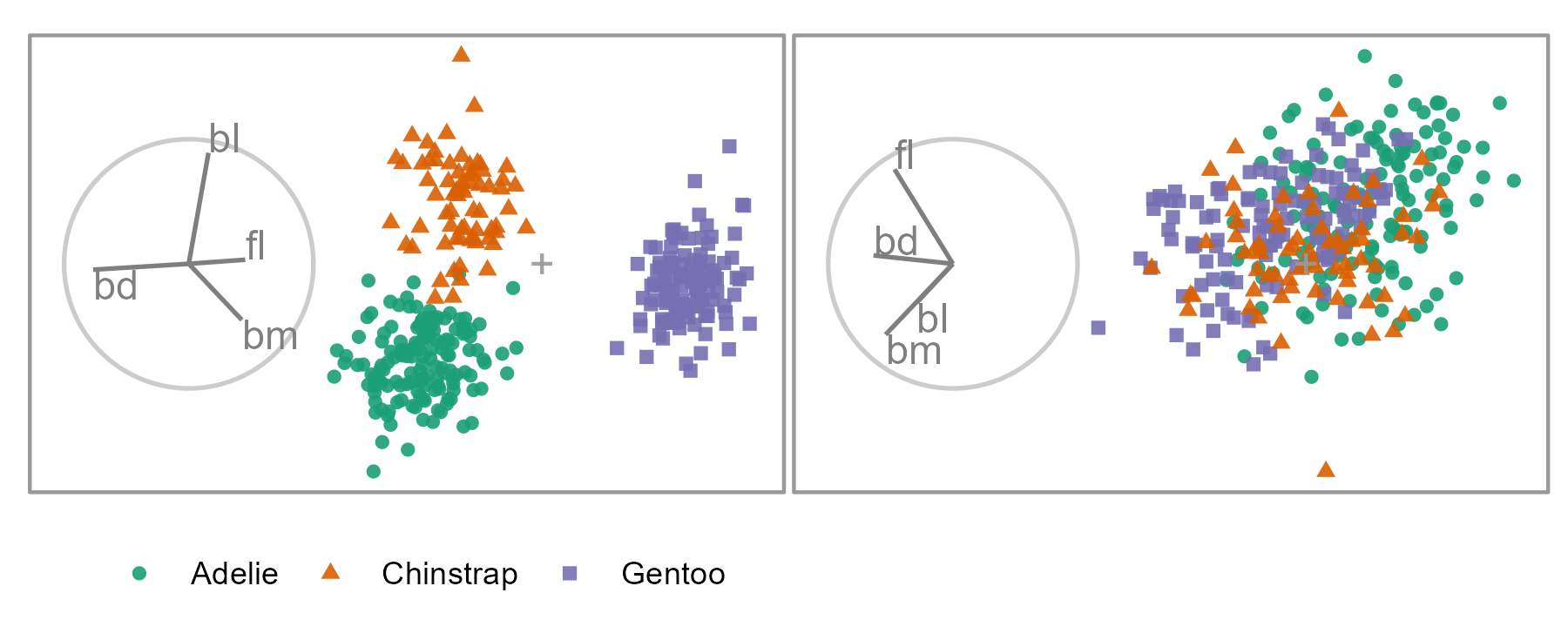
Figure 1.1: Two linear projections of penguins data. Biplot circles depict the basis indicating the direction and magnitude of the variable contributions. In the left panel, the direction of the separation between the orange and green clusters is in the direction that bl contributes, meaning that this variable is sensitive to the separation of this cluster. The purple cluster’s separation is attributed primarily to bd and smaller contributions from fl and bm. Many other linear orientations do not resolve structures of interest, such as cluster separation (right panel). The Palmer Penguin data (Gorman et al. 2014; Horst et al. 2020) measures four physical variables: bill length (bl), bill depth (bd), flipper length (fl), and body mass (bm) for three species of penguins.
There are many features that an analyst may be interested in when analyzing multivariate data. Shape, spread, cluster separation, outliers, and irregularities are the most common. Not all basis orientations will reveal the features in the data. Thus the choice of basis is essential. Furthermore, the analyst is interested in understanding the variables that reveal features. For instance, Figure 1.1 shows two linear projections of penguin data. The color and shape of the data points distinguish the three penguin species. The linear projection used in the left panel contains a significant separation of the clusters, while the right panel does not show differences between the species clusters.
Therefore, it makes sense for an analyst to explore many projections with very different bases. However, it can be challenging to link observations across large discrete jumps to other projections with no intermediate information. The tour is a dynamic visualization that overcomes this difficulty (Cook et al. 2008; Lee et al. 2021). It is a class of linear projections that animate over small changes to the projection basis. A vital feature of the tour is the visual permanence and trackability of the points through the frames. In the shadow analogy, an object such as a barstool will cast a circular shadow if the light is directly above the seat. However, such a shadow does not give the observer sufficient information as it could arise from any number of shapes that contain circular profiles: spheres, cylinders, or circles. However, if the stool was rotated, its legs would show in the shadow, giving an intuitive interpretation of the object. Similarly, the rotation of a data object yields information about its structure.
Traditional methods of viewing component spaces and the original tour have no means to influence the path of its bases. Cook and Buja (1997) introduce the manual tour, offering user control over the basis. By selecting a variable and initializing an additional manipulation dimension onto a projection, the contribution of the variable can be controlled through a rotation of the manipulation space. The user-controlled steering enables the analyst to assess the variable sensitivity to the structure identified in a projection.
The manual tour allows the analyst to control the angle and magnitude that a variable contributes to the projection. However, influencing the magnitude is more meaningful as angular manipulations effectively rotate a projection, changing the relative position but not the amounts of the variables. Because of this, this work focuses on a specific manual tour, the radial tour. In this tour, the manipulation angle is fixed, but a variable’s magnitude changes (along the contribution radius to the basis). Figure 1.2 shows a radial tour of the penguins data varying the contribution of bill length. The left panel has a total contribution from bl, while the middle panel shows half contribution, and bill length has been removed in the right panel. The separation between orange and green clusters was in the direction of the contribution of bl and when this contribution is removed, so too is the separation of the clusters. Because of this, this variable is said to be sensitive to the separation of these two clusters.
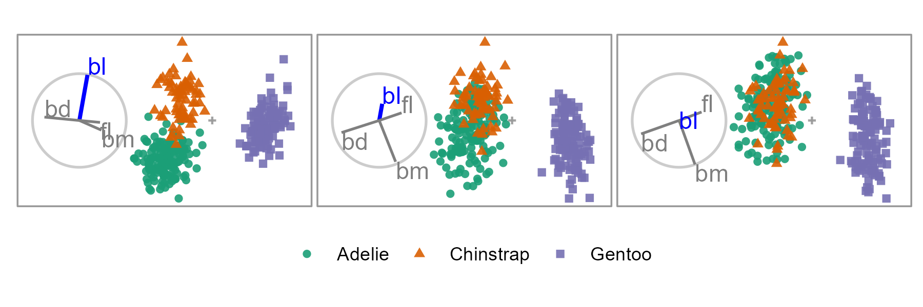
Figure 1.2: A radial tour changing the contribution of bill length (bl). When bill length has a considerable contribution, the clusters of orange and green are separated (left and middle). When its contribution is removed, the clusters overlap (right). Because of this, we say that bill length is sensitive to the separation of these two species. An animated version can be viewed at vimeo.com/676723431.
1.1 Research questions
Discerning variable sensitivity to the structure is crucial to understanding which variables contribute to a revealed feature. We conjecture that the user interaction afforded by the radial tour should allow for a more precise exploration of this structure by testing the variable sensitivity to that structure. The over-arching question of interest can, therefore, be stated as:
Can the radial tour, with user-steering of the basis, help analysts’ understanding of the variable sensitivity to structure in the projection?
Which is sectioned into the three following questions.
RQ 1. How do we define and implement a user interface and interactions for the radial tours to add and remove variables smoothly from 1- and 2D linear data projections?
Cook and Buja (1997) laid out the theoretical work for the manual (and hence radial) tour, while some details are light. Furthermore, there is an absence of a publicly available implementation, fully-featured interface design, implementation notes, and performance evaluation over alternatives.
RQ 2. Does the use of the interactive radial tour improve analysts’ understanding of the relationship between variables and structure in 2D linear projections compared to existing approaches?
At present, the radial tour is not used by analysts. Instead, they would use a single projection to understand the structure, almost always principal components analysis (PCA, Pearson 1901), which chooses the basis that shows the most variation. Another approach is to use the grand tour (Asimov 1985). The grand tour animates many interpolated frames between randomly selected target bases. Neither PCA nor the grand tour provides a means for manually manipulating a desired variable’s contribution to the basis. We wish to investigate if the basis-steering of the radial tour facilitates a better understanding of variable sensitivity to the structure.
RQ 3. Can the radial tours be used in conjunction with local explanations to improve the interpretability of black-box models?
Complex nonlinear models are also being applied more frequently to predict or classify from many predictors. While these models lead to increased accuracy over linear models, they suffer from a loss of the interpretability of their variables. One aspect of eXplainable Artificial Intelligence (XAI, Adadi and Berrada 2018; Arrieta et al. 2020) tries to preserve the interpretability of such models through local explanations. These explanations are essentially linear variable importance in the vicinity of one observation of a model. That is, the extent to which variables help the model explain the difference between the observed means and an observation’s prediction. The user control from the radial tour potentially allows an analyst to better understand the model and the range of these local explanations.
1.2 Methodology
The research corresponding to RQ 1 entails algorithm & software design (Kleinberg and Tardos 2006), and adapts the algorithm described in (Cook and Buja 1997).
To address RQ 2, experimental design (Winer 1962) is used. A task and measure must be defined that is suitable to evaluate the radial tour against alternatives. The experimental factors and their levels must be selected and randomly assigned as a randomized controlled trial to measure the efficacy of user-controlled radial tours compared with two benchmark methods.
The research responding to RQ 3 involves design science (Hevner et al. 2004). It is not obvious how to combine a radial tour with a nonlinear model. A local explanation approximates the linear variable importance in the vicinity of one observation. Two novel interactive visualizations need to be developed. The first should visually facilitate the selection of observations to explore. The second should extend the biplot to show the distribution of local explanations from all observations while a radial tour is created starting from the attribution of one observation. This will examine the variable sensitivity to the structure identified in the local explanation.
1.3 Contributions
The contributions resulting from the research to address these research questions can be split into scientific knowledge and software contributions:
1.3.1 Scientific knowledge
- Radial tour algorithm
- Refined and clarified the steps to producing a radial tour based on Rodrigues’ rotation formula (Rodrigues 1840).
- Provides new examples of usage.
- A user study comparing the radial tour’s efficacy against two alternatives — PCA and the grand tour. This is the first empirical evaluation of the radial tour.
- Creation of supervised classification task to assess the variable attribution to the separation of two clusters.
- As tested over experimental factors: location, shape, and dimensionality.
- Definition of an accuracy measure to evaluate this task.
- Results: strong evidence that the radial tour increases the accuracy of this task by a sizable amount and minor evidence to suggest a moderate increase in accuracy of the grand tour over PCA.
- Mixed model regression helps to attribute the source of the error by accounting for the uncontrolled variability of participant’s skills and the difficulty of the simulation due to chance.
- Cheem analysis, a novel analysis (and interactive visualizations) using the radial tour to explore the variable sensitivity of local explanations from nonlinear models, part of XAI.
- A global view approximates the variable space, attribution space, and residual plot side-by-side, which serves to identify observations of interest.
- Selected observation’s normalized variable attribution is used as a projection basis.
- Explore the support of the local explanation using the radial tour; the variable sensitivity to the structure identified tests the range of contributions supporting the explanation.
1.3.2 Software
- spinifex, an R package for transforming data, performing manual tours, and extending any tour’s display and animation exportation.
- Facilitates the transformation of quantitative variables in the data.
- Identify various bases finding various features of the data.
- Creation of manual tours allows analyst steering of the basis to explore the variable sensitivity to the structure.
- Layered composition of tour displays that mirrors the approach in ggplot2 (Wickham 2016), interoperable with tours made by tourr (Wickham et al. 2011).
- Exporting rendered animation either to interactive
htmlwidgets with plotly (Sievert 2020) or togif,mp4, and other video formats with gganimate (Pedersen and Robinson 2020). - Interactive shiny (Chang et al. 2021) application to preprocess data and explore. Users can choose from six supplied datasets or upload their own.
- Vignettes and code examples help users get up to speed.
- cheem, an R package that facilitates the exploration of local explanations of nonlinear models through the radial tour.
- Preprocessing: given a tree-based model, calculate the tree SHAP local explanation (via treeshap, Kominsarczyk et al. 2021) of all observations and statistics that accent the separability of this space.
- Visualization of approximations of the data space, attribution space, and residual plot side-by-side with linked brushing, hover tooltips, and tabular display facilitates the selection of observations to explore.
- Use of the radial tour changes variable contribution to test the support of the variable contribution in agreement with the explanation.
- Interactive application facilitates this analysis for several prepared datasets or user preprocessed data.
- A vignette and code examples help users get up to speed.
1.4 Thesis structure
The remainder of the thesis is organized as follows: Chapter 2 covers various visualization techniques before introducing related studies, nonlinear models, and their interpretability issues. Chapter 3 discusses the clarifies solving the rotation matrix, supports use with new cases, and the implementation of the radial tours in the package spinifex. Chapter 4 discusses a user study evaluating the radial tour’s efficacy compared with PCA and the grand tour. Chapter 5 introduces novel analysis and visuals to explore the variable sensitivity of local explanation with the radial tour. It also discusses the cheem package and graphical user interface for facilitating this analysis. Lastly, Chapter 6 concludes with some takeaways and a discussion of limitations and possible extensions.