Chapter 4 A Study on the Benefit of a User-Controlled Radial Tour for Variable Attribution of Structure
The previous chapter introduced the package spinifex, which provides the means to perform radial tours. As discussed in Chapter 2, no empirical evidence suggests that the radial tour’s user-controlled steering leads to a better perception than traditional methods. Therefore, this chapter discusses the user study to elucidate the efficacy of the radial tour.
Chapters 1 and 2 introduced PCA, the grand tour, and the radial tour. These methods are used as comparisons to measure the effectiveness of the radial tour. A supervised classification task is designed to evaluate variable attribution of the separation between two classes. An accuracy measure is defined as a response variable. Data were collected from 108 crowdsourced participants, who performed two trials with each visual for 648 trials in total.
The user influence over a basis is crucial to testing variable sensitivity to the structure visible in projection and uniquely available in the radial tour. If the contribution of a variable is reduced and the feature disappears, then it is said that the variable is sensitive to that structure. For example, Figure 4.1 shows two projections of simulated data. Panel (a) has identified separation between the two clusters and primarily in the direction of the contribution from V2. Many other bases do not reveal this cluster separation, such as panel (b) with a small contribution from V2. Because of this, it is said that V2 is sensitive to the separation of the clusters.
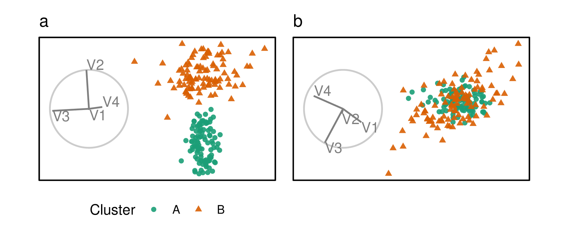
Figure 4.1: Illustration of cluster separation affected by variable importance. Panel (a) is a projection mostly of V2 and V3, and the separation between clusters is in the direction of V2, not V3. This suggests V2 is important for clustering, but V3 is not. Panel (b) shows a projection of mostly V3 and V4, with no contribution from V2 and little from V3. The absence of separation between the clusters indicates that V3 and V4 are not important.
This chapter is structured as follows. Section 4.1 describes the implementation of the user study: its visual methods, experimental factors, task, accuracy measure used, and randomization of the experiment. The study results are discussed in Section 4.2. Conclusions and potential future directions are discussed in Section 4.3. An accompanying application and extended analysis are provided in the appendix under Section B.3.
4.1 User study
An experiment was constructed to assess the performance of the radial tour relative to the grand tour and PCA for interpreting the variable attribution contributing to separation between two clusters. Data were simulated across three experimental factors: location of the cluster separation, cluster shape, and data dimensionality. Participant responses were collected using a web application and crowdsourced through prolific.co, (Palan and Schitter 2018) an alternative to MTurk.
4.1.1 Objective
PCA will be used as a baseline for comparison as it is the most commonly used linear embedding. It will use static, discrete jumps between orthogonal components. The grand tour will act as a secondary control that will help evaluate the benefit of observation trackability between nearby animation frames but without user control of its path. Lastly, the radial tour will be compared, which benefits from both the continuity of animation and user control.
Then for some subset of tasks, we expect to find that the radial tour performs most accurately. Conversely, we are less sure about the accuracy of such limited grand tours as there is no objective function in selecting the bases; it is possible that the random selection of the target bases altogether avoids bases showing cluster separation. However, given that the data dimensionality is modest, it seems plausible that the grand tour coincidentally regularly crossed bases with the correct information for the task.
Experimental factors and the definition of an accuracy measure are given below. The hypothesis can be stated as follows:
\[\begin{align*} &H_0: \text{accuracy does not change across the visual methods} \\ &H_\alpha: \text{accuracy does change across the visual methods} \end{align*}\]
4.1.2 Visual factors
The visual methods are tested within participants, with each visual being evaluated twice by each participant. The order in which experimental factors are experienced is randomized with the assignment, as illustrated in Figure 4.4. Below discusses the design standardization and unique input associated with each visual.
The visualization methods were standardized wherever possible. Data were displayed as 2D scatterplots with biplots. All aesthetic values (color blind safe colors, shapes, sizes, absence of legend, and axis titles) were constant. The variable contribution biplot was always shown left of the scatterplot embeddings with their aesthetic values consistent. What did vary between visuals were their inputs.
PCA allowed users to select between the top four principal components for each axis regardless of the data dimensionality (four or six). Upon changing an axis, the visual would change to the new view of orthogonal components without displaying intermediate bases. There was no user input for the grand tour; users were instead shown a 15-second animation of the same randomly selected path (variables containing cluster separation were shuffled after simulation). Participants could view the same clip up to four times within the time limit. Radial tours allowed participants to select the manipulation variable. The starting basis was initialized to a half-clock design, where the variables were evenly distributed in half of the circle. This design was created to be variable agnostic while maximizing the independence of the variables. Selecting a new variable resets the animation where the new variable is manipulated to a complete contribution, zeroed contribution, and then back to its initial contribution. Animation and interpolation parameters were constant across grand and radial tours (five frames per second with a step size of 0.1 radians between interpolated frames).
4.1.3 Experimental factors
In addition to the visual method, data are simulated across three experimental factors. First, the separation location between clusters is controlled by mixing a signal and a noise variable at different ratios. Secondly, the shape of the clusters reflects varying data distributions. And third, the dimension-ality of the data is also tested. The levels within each factor are described below, and Figure 4.2 gives a visual representation.
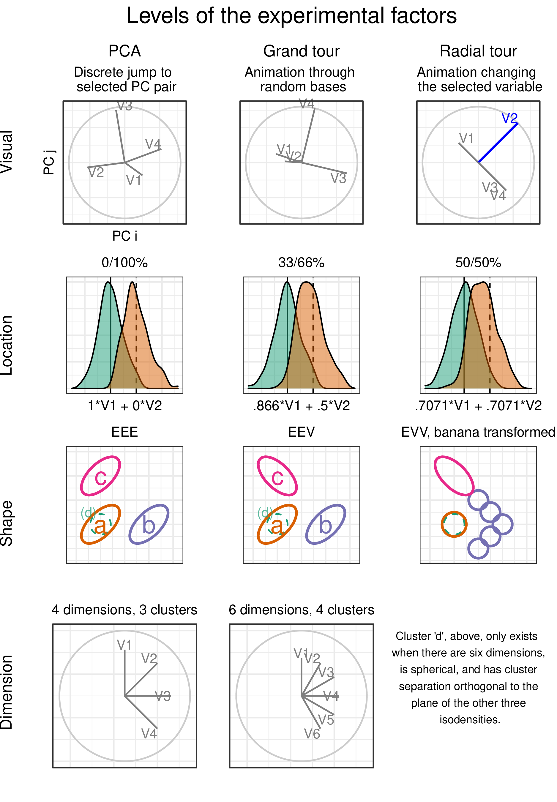
Figure 4.2: Levels of the visuals and three experimental factors: location of cluster separation, the shape of clusters, and dimensionality of the sampled data.
The location of the separation between the clusters is at the heart of the measure. It would be good to test a few varying levels. To test the sensitivity, a noise, and signal-containing variable are mixed. The separation between clusters is mixed at the following percentages: 0/100% (not mixed), 33/66%, 50/50% (evenly mixed).
In selecting the shape of the clusters, the convention given by Scrucca et al. (2016) is followed. They describe 14 variants of model families containing three clusters. The model family name is the abbreviation of the cluster’s respective volume, shape, and orientation. The levels are either Equal or Vary. The models EEE, EEV, and EVV are used. For instance, in the EEV model, the volume and shape of clusters are constant, while the shape’s orientation varies. The EVV model is modified by moving four-fifths of the data out in a “>” or banana-like shape.
Dimension-ality is tested at two modest levels: four dimensions containing three clusters and six with four clusters. Such modest dimensionality is required to limit the difficulty and search space to make the task realistic for crowdsourcing.
4.1.4 Task and evaluation
With our hypothesis formulated and data at hand, let us turn our attention to the task and how to evaluate it. Regardless of the visual method, the display elements are held constant, shown as a 2D scatterplot with a biplot (Gabriel 1971) to its left. A biplot is a visual depiction of the variable contributions from the basis inscribed in a unit circle. Observations were supervised with cluster membership mapped to (color blind safe) color and shape.
Participants were asked to “check any/all variables that contribute more than average to the cluster separation green circles and orange triangles,” which was further explained in the explanatory video as “mark any and all variable that carries more than their fair share of the weight, or one quarter in the case of four variables.”
The instructions were iterated several times in the video was: 1) use the input controls to find a frame that contains separation between the clusters of green circles and orange triangles, 2) look at the orientation of the variable contributions in the gray circle (biplot axes orientation), and 3) select all variables that contribute more than uniformed distributed cluster separation in the scatterplot. Independent of the experimental level, participants were limited to 60 seconds for each evaluation of this task. This restriction did not impact many participants, as the 25th, 50th, and 75th quantiles of the response time were about 7, 21, and 30 seconds, respectively.
The accuracy measure of this task was designed with a couple of features in mind. 1) symmetric about the expected value, without preference for under- or over-guessing. 2) heavier than linear weight with an increasing difference from the expected value. The following measure is defined for evaluating the task.
Let the data \(\textbf{X}_{n,~p,~k}\) be a simulation containing clusters of observations of different distributions. Where \(n\) is the number of observations, \(p\) is the number of variables, and \(k\) indicates the observation’s cluster. Cluster membership is exclusive; an observation cannot belong to more than one cluster.
The weights, \(w\), is a vector, the variable-wise difference between the mean of two clusters of less \(1/p\), the expected cluster separation if it were uniformly distributed between variables. Accuracy, \(A\) is defined as the signed square of these weights if selected by the participant. Participant responses are a logical value for each variable — whether or not the participant thinks each variable separates the two clusters more than uniformly distributed separation.
\[\begin{equation*} w_{j} = \frac{ (\overline{X}_{\cdot, j=1, k=1} - \overline{X}_{\cdot, 1, 2}, ~...~ (\overline{X}_{\cdot, p, 1} - \overline{X}_{\cdot, p, 2})} {\sum_{j=1}^{p}(|\overline{X}_{\cdot, j, k=1} - \overline{X}_{\cdot, j, 2}|)} - \frac{1}{p} \end{equation*}\] \[\begin{equation*} A = \sum_{j=1}^{p}I(j) \cdot sign(w_j) \cdot w^2 \end{equation*}\]
Where \(I(j)\) is the indicator function, the binary response for variable \(j\). Figure 4.3 shows one projection of a simulation with its observed variable separation (wide bars), expected uniform separation (dashed line), and accuracy if selected (thin lines).
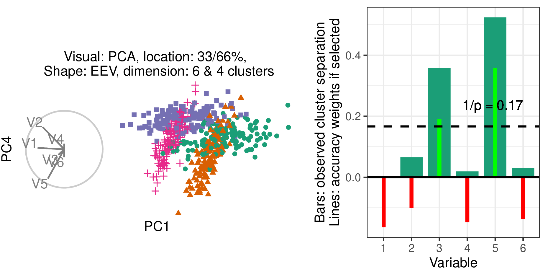
Figure 4.3: Illustration of how accuracy is measured. (L), Scatterplot and biplot of PC1 by PC4 of a simulated data set (R) illustrates cluster separation between the green circles and orange triangles. Bars indicate observed cluster separation, and (red/green) lines show the accuracy weights for the variables if selected. The horizontal dashed line is \(1 / p\), the expected value of cluster separation. The accuracy weights equal the signed square of the difference between each variable value and the dashed line.
4.1.5 Data simulation
Each dimension is distributed initially as \(\mathcal{N}(0, 1)\), given the covariance set by the shape factor. Clusters were initially separated by a distance of two before location mixing. Signal variables had a correlation of 0.9 when they had equal orientation and -0.9 when their orientations varied. Noise variables were restricted to zero correlation. Each cluster is simulated with 140 observations and is offset in a variable that did not distinguish previous variables.
Clusters of the EVV shape are transformed to the banana-chevron shape (illustrated in figure 4.2, shape row). Then location mixing is applied by post-multiplying a rotation matrix to the signal variable and a noise variable for the clusters in question. All variables are then standardized by standard deviations away from the mean. The columns are then shuffled randomly.
Each of these replications is then iterated with each level of the visual. For PCA, projections were saved (to png) for each of the 12 pairs of the top four principal components. A grand tour basis path is saved for each dimensionality level. The data from each simulation is then projected through its corresponding bases path and saved to a gif file. The radial tour starts at either the four or six-variable “half-clock” basis. A radial tour is then produced for each variable and saved as a gif.
4.1.6 Randomized assignment
With simulation and their artifacts in hand, this section covers how the experimental factors are assigned and demonstrates how the participant’s perspective experiences this.
The study is sectioned into three periods. Each period is linked to a randomized level of visual and location. The order of dimension and shape are of secondary interest and are held constant in increasing order of difficulty; four, then six dimensions, and EEE, EEV, then EVV-banana, respectively.
Each period starts with an untimed training task at the simplest remaining experimental levels; location = 0/100%, shape = EEE, and four dimensions with three clusters. This serves to introduce and familiarize participants with input and visual differences. After the training, the participant performs two trials with the same visual and location level across the increasing difficulty of dimension and shape. The plot was removed after 60 seconds, though participants rarely reached this limit.
The order of the visual and location levels is randomized with a nested Latin square where all levels of the visuals are exhausted before advancing to the next level of location. This requires \(3!^2 = 36\) participants to evaluate all permutations of the experimental factors once. This randomization controls for potential learning effects the participant may receive. Figure 4.4 illustrates how an arbitrary participant experiences the experimental factors.
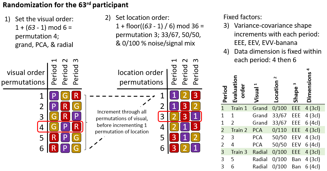
Figure 4.4: Illustration of how a hypothetical participant 63 is assigned experimental factors. Each of the six visual order permutations is exhausted before iterating to the next permutation of location order.
Through pilot studies sampled by convenience (information technology and statistics Ph.D. students attending Monash University), it was estimated that three full evaluations are needed to power the study properly, a total of \(N = 3 \times 3!^2 = 108\) participants.
4.1.7 Participants
\(N = 108\) participants were recruited via prolific.co (Palan and Schitter 2018). Participants are restricted based on their claimed education requiring that they have completed at least an undergraduate degree (some 58,700 of the 150,400 users at the time). This restriction is used on the premise that linear projections and biplot displays will not be regularly used for consumption by general audiences. There is also the implicit filter that Prolific participants must be at least 18 years of age and implicit biases of timezone, location, and language. Participants were compensated for their time at 7.50 per hour, whereas the mean duration of the survey was about 16 minutes. Previous knowledge or familiarity was minimal, as validated in the follow-up survey. The appendix Section B.3.2 contains a heatmap distribution of age and education paneled across preferred pronouns of the participants that completed the survey, who are relatively young, well educated, and slightly more likely to identify as males.
4.1.8 Data collection
Data were recorded by a shiny application and written to a Google Sheet after each third of the study. Especially at the start of the study, participants experienced adverse network conditions due to the volume of participants hitting the application with modest allocated resources. In addition to this, API read/write limitations further hindered data collection. To mitigate this, the number of participants was throttled, and over-collect survey trials until three evaluations were collected for all permutation levels.
The processing steps were minimal. The data were formatted and then filtered to the latest three complete studies of each experimental factor, which should have experienced the least adverse network conditions. The bulk of the studies removed were partial data and a few over-sampled permutations. This brings us to the 108 studies described in the chapter, from which models and aggregation tables were built. The post-study surveys were similarly decoded into a human-readable format. Of the 108 participants, 84 also completed the follow-up survey.
4.2 Results
To recap, the primary response variable is accuracy, as defined in Section 4.1.4. The parallel analysis of the log response time is provided in the appendix, Section B.3.3. Two primary data sets were collected; the user study evaluations and the post-study survey. The former is the 108 participants with the experimental factors: visual, location of the cluster separation signal, the shape of variance-covariance matrix, and the dimensionality of the data. Experimental factors and randomization were discussed in section 4.1.3. A follow-up survey was completed by 84 of these 108 people. It collected demographic information (preferred pronoun, age, and education) and subjective measures for each visual (preference, familiarity, ease of use, and confidence).
Below a battery of mixed regression models are fit. They regress the accuracy given the visual factor used and progressively more complex main effects from the explanatory variables. Then, Likert plots and rank-sum tests to compare the subjective measures between the visuals.
4.2.1 Accuracy
To quantify the contribution of the experimental factors to the accuracy, mixed-effects models were fit. All models have a random effect term on the participant and the simulation. These terms explain the amount of error attributed to the individual participant’s effect and variation due to the random sampling data.
In building a set of models to test, a base model with only the visual term is compared with the full linear model term and progressively interacts with an additional experimental factor. The models with three and four interacting variables are rank deficient; there is not enough varying information in the data to explain all interacting terms.
\[ \begin{array}{ll} \textbf{Fixed effects} &\textbf{Full model} \\ \alpha &\widehat{Y} = \mu + \alpha_i + \textbf{Z} + \textbf{W} + \epsilon \\ \alpha + \beta + \gamma + \delta &\widehat{Y} = \mu + \alpha_i + \beta_j + \gamma_k + \delta_l + \textbf{Z} + \textbf{W} + \epsilon \\ \alpha \times \beta + \gamma + \delta &\widehat{Y} = \mu + \alpha_i \times \beta_j + \gamma_k + \delta_l + \textbf{Z} + \textbf{W} + \epsilon \\ \alpha \times \beta \times \gamma + \delta &\widehat{Y} = \mu + \alpha_i \times \beta_j \times \gamma_k + \delta_l + \textbf{Z} + \textbf{W} + \epsilon \\ \alpha \times \beta \times \gamma \times \delta &\widehat{Y} = \mu + \alpha_i \times \beta_j \times \gamma_k \times \delta_l + \textbf{Z} + \textbf{W} + \epsilon \end{array} \] \[ \begin{array}{ll} \text{where } &\mu \text{, the intercept of the model} \\ &\alpha_i \text{, fixed term for visual}~|~i\in (\text{pca, grand, radial}) \\ &\beta_j \text{, fixed term for location}~|~j\in (\text{0/100\%, 33/66\%, 50/50\%}) \text{ noise/signal mixing} \\ &\gamma_k \text{, fixed term for shape}~|~k\in (\text{EEE, EEV, EVV banana}) \text{ model shapes} \\ &\delta_l \text{, fixed term for dimension}~|~l\in (\text{4 variables \& 3 cluster, 6 variables \& 4 clusters}) \\ &\textbf{Z} \sim \mathcal{N}(0,~\tau), \text{ the error of the random effect of participant} \\ &\textbf{W} \sim \mathcal{N}(0,~\upsilon), \text{ the error of the random effect of simulation} \\ &\epsilon \sim \mathcal{N}(0,~\sigma), \text{ the remaining error in the model} \\ \end{array} \]
| Fixed effects | No. levels | No. terms | AIC | BIC | R2 cond. | R2 marg. | RMSE |
|---|---|---|---|---|---|---|---|
| a | 1 | 3 | -71 | -44 | 0.303 | 0.018 | 0.194 |
| a+b+c+d | 4 | 8 | -45 | 4 | 0.334 | 0.056 | 0.194 |
| a*b+c+d | 5 | 12 | -26 | 41 | 0.338 | 0.064 | 0.193 |
| a*b*c+d | 8 | 28 | 28 | 167 | 0.383 | 0.108 | 0.19 |
| a*b*c*d | 15 | 54 | 105 | 360 | 0.37 | 0.222 | 0.185 |
| Estimate | Std. Error | df | t value | Pr(>|t|) | ||
|---|---|---|---|---|---|---|
| (Intercept) | 0.10 | 0.06 | 16.1 | 1.54 | 0.143 | |
| Visual | ||||||
| Visualgrand | 0.06 | 0.04 | 622.1 | 1.63 | 0.104 | |
| Visualradial | 0.14 | 0.04 | 617.0 | 3.77 | 0.000 | *** |
| Fixed effects | ||||||
| Location33/66% | -0.02 | 0.07 | 19.9 | -0.29 | 0.777 | |
| Location50/50% | -0.04 | 0.07 | 20.0 | -0.66 | 0.514 | |
| ShapeEEV | -0.05 | 0.06 | 11.8 | -0.82 | 0.427 | |
| Shapebanana | -0.09 | 0.06 | 11.8 | -1.54 | 0.150 | |
| Dim6 | -0.01 | 0.05 | 11.8 | -0.23 | 0.824 | |
| Interactions | ||||||
| Visualgrand:Location33/66% | -0.02 | 0.06 | 588.9 | -0.29 | 0.774 | |
| Visualradial:Location33/66% | -0.12 | 0.06 | 586.5 | -2.13 | 0.033 |
|
| Visualgrand:Location50/50% | -0.03 | 0.06 | 591.6 | -0.47 | 0.641 | |
| Visualradial:Location50/50% | -0.06 | 0.06 | 576.3 | -1.16 | 0.248 | |
Table 4.1 compares the model summaries across increasing complexity. The \(\alpha \times \beta + \gamma + \delta\) model to is selected to examine in more detail as it has relatively high condition \(R^2\) and not overly complex interacting terms. Table 4.2 looks at the coefficients for this model. There is strong evidence suggesting a relatively large increase in accuracy due to the radial tour. Although there almost of all of that increase is lost under 33/66% mixing.
We also want to visually examine the conditional variables in the model. Figure 4.5 examines violin plots of accuracy by visual with panels distinguishing location (vertical) and shape (horizontal).
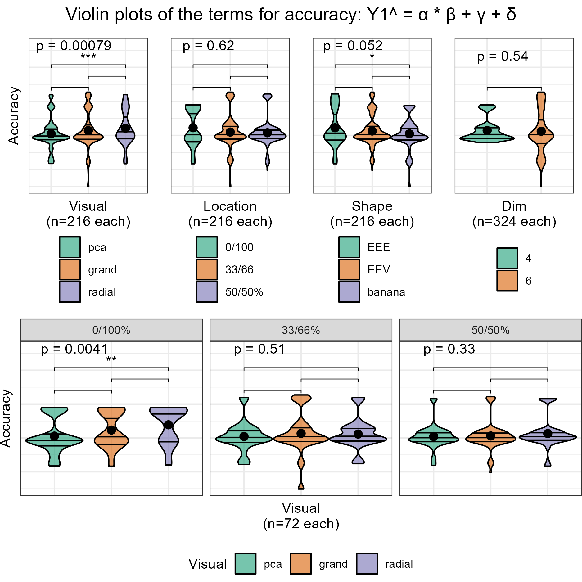
Figure 4.5: Violin plots of terms of the model \(\widehat{Y} = \alpha \times \beta + \gamma + \delta\). Overlaid with global significance from the Kruskal-Wallis test and pairwise significance from the Wilcoxon test, both are non-parametric, ranked-sum tests. Viewing the marginal accuracy of the terms corroborates the primary findings that the use of the radial tour leads to a significant increase in accuracy, at least over PCA, and this effect is particularly well supported when no location mixing is applied.
4.2.2 Subjective measures
The 84 evaluations of the post-study survey also collect four subjective measures for each visual. Figure 4.6 shows the Likert plots, or stacked percentage bar plots, along with violin plots with the same non-parametric, ranked sum tests. Participants preferred to use radial for this task. Participants were also more confident in their answers and found radial tours easier than grand tours. All visuals have reportedly low familiarity, as expected from crowdsourced participants.
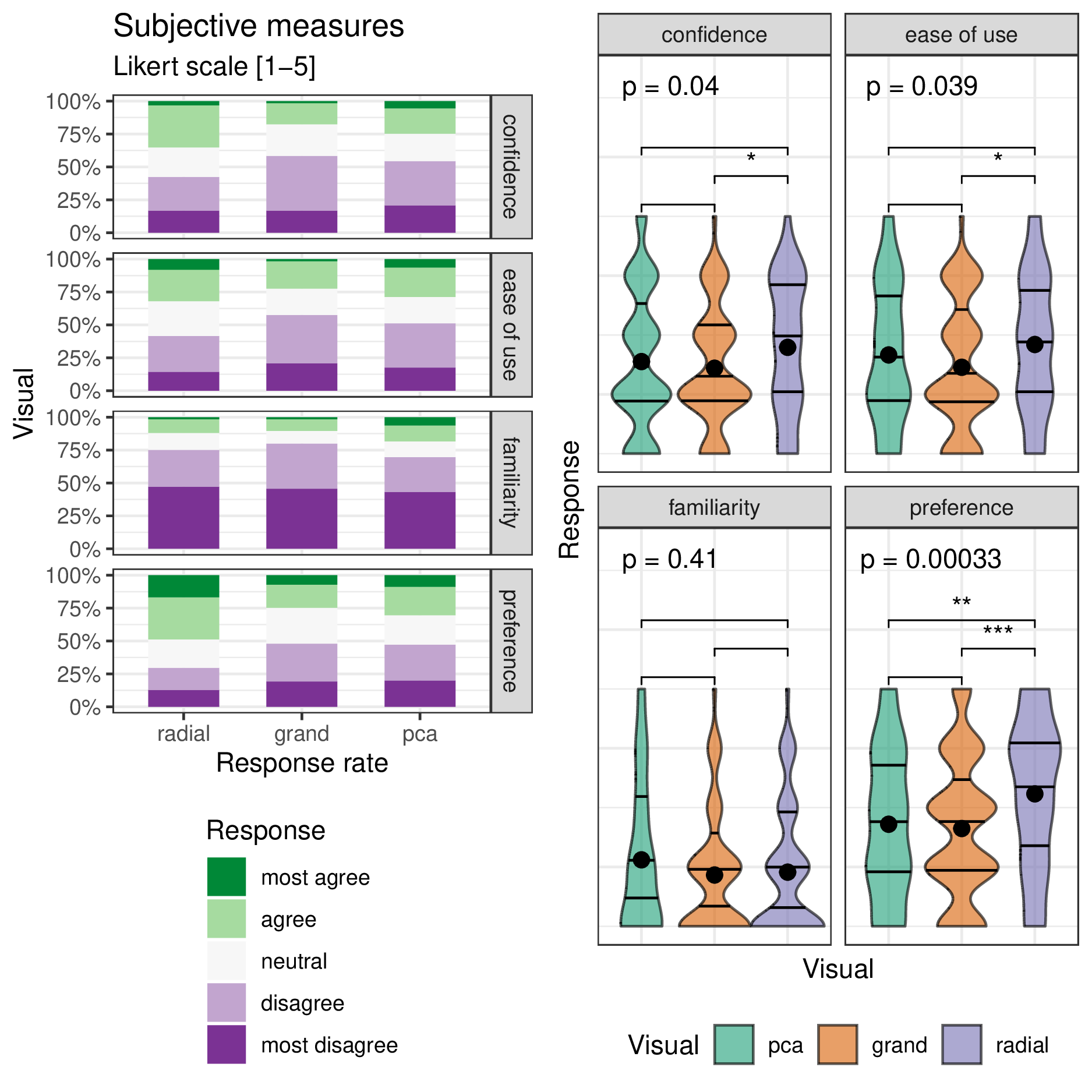
Figure 4.6: The subjective measures of the 84 responses to the post-study survey with five-point Likert items levels of agreement. (L) Likert plots (stacked percent bar plots) with (R) violin plots of the same measures. Violin plots are overlaid with global significance from the Kruskal-Wallis test and pairwise significance from the Wilcoxon test. Participants are more confident using the radial tour and find it easier to use than the grand tour. The radial tour is the most preferred visual.
4.3 Conclusion
Data visualization is an integral part of understanding relationships in data and how models are fitted. However, thorough exploration of data in high dimensions becomes difficult. Previous methods offer no means for an analyst to impact the projection basis. The manual tour provides a mechanism for changing the contribution of a selected variable to the basis. Giving analysts such control should facilitate the exploration of variable-level sensitivity to the identified structure.
This chapter discussed a with-in participant user study (\(n=108\)) comparing the efficacy of three linear projection techniques: PCA, grand tour, and radial tour. The participants performed a supervised cluster task, explicitly identifying which variables contribute to separating two target clusters. This was evaluated evenly over four experimental factors. In summary, mixed model regression finds strong evidence that using the radial tour sizably increases accuracy, especially with cluster separation location not being mixed at 33/66%. The effect sizes on accuracy are large relative to the change from the other experimental factors and the random effect of data simulation, though smaller than the random effect of the participant. The radial tour was the most preferred of the three visuals.
There are several ways that this study could be extended. In addition to expanding the support of the experimental factors, more exciting directions include: introducing a new task, visualizations used, and the experience level of the target population. It is difficult to achieve good coverage given the number of possible experimental factors.
The code, response files, analyses, and the study application are publicly available at https://github.com/nspyrison/spinifex_study. The participant instruction video can be viewed at https://vimeo.com/712674984.