Chapter 2 Background
The previous chapter discussed the importance of data visualization despite the complexity of viewing high-dimensional data and outlined the research questions to be addressed around the user-control of the radial tour. This chapter first motivates data visualization in general and the importance of interaction. It continues to illustrate standard visualizations for quantitative multivariate data before turning to dimension reduction, including further discussion of tours. Then empirical evaluations of multivariate visuals are covered. The chapter concludes with nonlinear models and the extension of their interpretation with local explanations.
2.1 Motivation
Visualization is much more robust than numerical summarization alone (Anscombe 1973; Matejka and Fitzmaurice 2017). Figure 2.1 illustrates this. The data sets have a quite different structure revealed in their visualization, while they contain the same summary statistics. All data sets have the same means, standard deviations, and correlation.
Figure 2.1: The datasaurus dozen is a modern data set illustrating Anscombe’s point that summary statistics cannot always adequately summarize data content. Patterns in the scatterplots are evident despite having the same summary statistics (\(x\) and \(y\) mean, standard deviations, and correlation). Unless the data is plotted, one would never know that there were such radical differences.
Interaction is an essential aspect of modern data visualization (Card et al. 1983; Marriott et al. 2018; Batch et al. 2019). Interaction facilitates accessing increasing amounts of data and amplifies cognition through control and input (Dimara and Perin 2019). Munzner (2014) posits that responsive and fast computer graphics allow us to move beyond paper and static resources. Interaction is key to navigating within views of sizable data and linking observations and features across these views.
We focus on multivariate data interactions with coordinated views, linked brushing, and tooltip display. Coordinated and multiple views (Roberts 2007) (also known as ensemble graphics, Unwin and Valero-Mora 2018) use several visuals that give a more comprehensive understanding than any one visual portrays in isolation. The linking of observations between different views and animation frames is facilitated by linked brushing (Becker and Cleveland 1987). In linked brushing, selected observations in one view are colored across all views, allowing these selections to be tracked and correlated across other views and frames. Linked brushing has proved helpful in animated tours (Arms et al. 1999; Laa et al. 2020; Lee et al. 2020). Tooltip displays upon the cursor hovering over observation can display identification information and other associated values to aid with point identification and more detailed information to be accessed (Sievert 2018). The interactive selection of parameters extends the breadth of analysis.
2.2 Multivariate visualization
In this thesis, we are concerned with the visualization of multivariate data. Specifically, we are interested in quantitative multivariate data. We assume that our data consists of \(n\) observations of \(p\) variables. Generally, \(n>p\), there are many more observations than variables. While written as though operating on the original variables, the discussion below could also be applied to reduced component spaces (such as PCA approximation in a few components) or feature decomposition of data not fitting this format. Kang et al. (2017) provide an excellent example of decomposing time series data in a quantitative feature matrix.
Grinstein et al. (2002) illustrate many multivariate visualization methods. In particular, this work shows examples of actual visuals. Liu et al. (2017) give a good classification and taxonomy of such methods. The content below focuses on the most common and the most relevant visuals. Illustrations are provided with the Palmer penguins data used in the Introduction. This data contains 333 observations of three penguin species across four physical measurements: bill length, bill depth, flipper length, and body mass. Observations were collected between 2007 and 2009 near Palmer Station, Antarctica. The penguins data is a good substitute for the over-used iris data.
2.2.1 Scatterplot matrices
An analyst could look at \(p\)-univariate histograms or density curves. Extending this idea, pairs of variables can be exhaustively viewed. Combining these brings us to scatterplot matrices, also known as SPLOM (Chambers et al. 1983). In a scatterplot matrix, variables are arranged across the columns and rows. The diagonal elements show univariate densities, while off-diagonal positions show scatterplot pairs, as in Figure 2.2. This is useful for exploring the range of the variables but will not scale well when the number of variables is large. Such visualization will only partially resolve features that could be better shown with contributions from more dimensions.
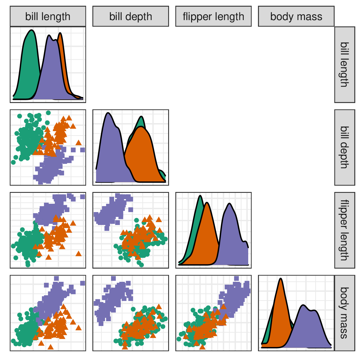
Figure 2.2: A scatterplot matrix shows univariate densities and all pairs of bivariate scatterplots. The panels show partial cluster separation, indicating that these variables contain discerning information. This approach is suitable for quickly exploring the range of the data but will not reveal features in more than two dimensions. It is a good exploratory visual but does not scale well with increasing variables.
As \(n\) increases, scatterplot displays also suffer from occlusion as the points overlap each other. This is typically addressed in a few ways. One method would decrease points’ opacity, allowing more layers to be seen. Another approach is to change the geometric display, such as a 2D density contour or an aggregated heatmap (illustrated in Figure 2.5). Aggregated displays typically render faster and scale better with increasing observations. Or, if needed, visualization can be performed on a representative subset of the data.
2.2.2 Parallel coordinate plots
In scatterplot matrices, each observation is split across all panels. In contrast, observation-linked visuals have a single line or glyph for each observation. In parallel coordinate plots (Ocagne 1885), variables are arranged horizontally, and lines connect observations after being transformed to a common scale such as quantiles or z-score (standard deviations away from the mean). Figure 2.3 illustrates this method.
Parallel coordinate plots scale much better with dimensions than scatterplot matrices but more poorly with observations. They also suffer from an asymmetry with the variable order. That is, changing the order of the variables may lead to very different conclusions. The \(x\)-axis is also used to display variables rather than the values of the observations. This restricts the amount of information that can be interpreted between variables. Munzner (2014) asserts that position is the more human-perceptible channel for encoding information; we should prefer to reserve it for distinguishing between values of the observations rather than the arrangement of variables.
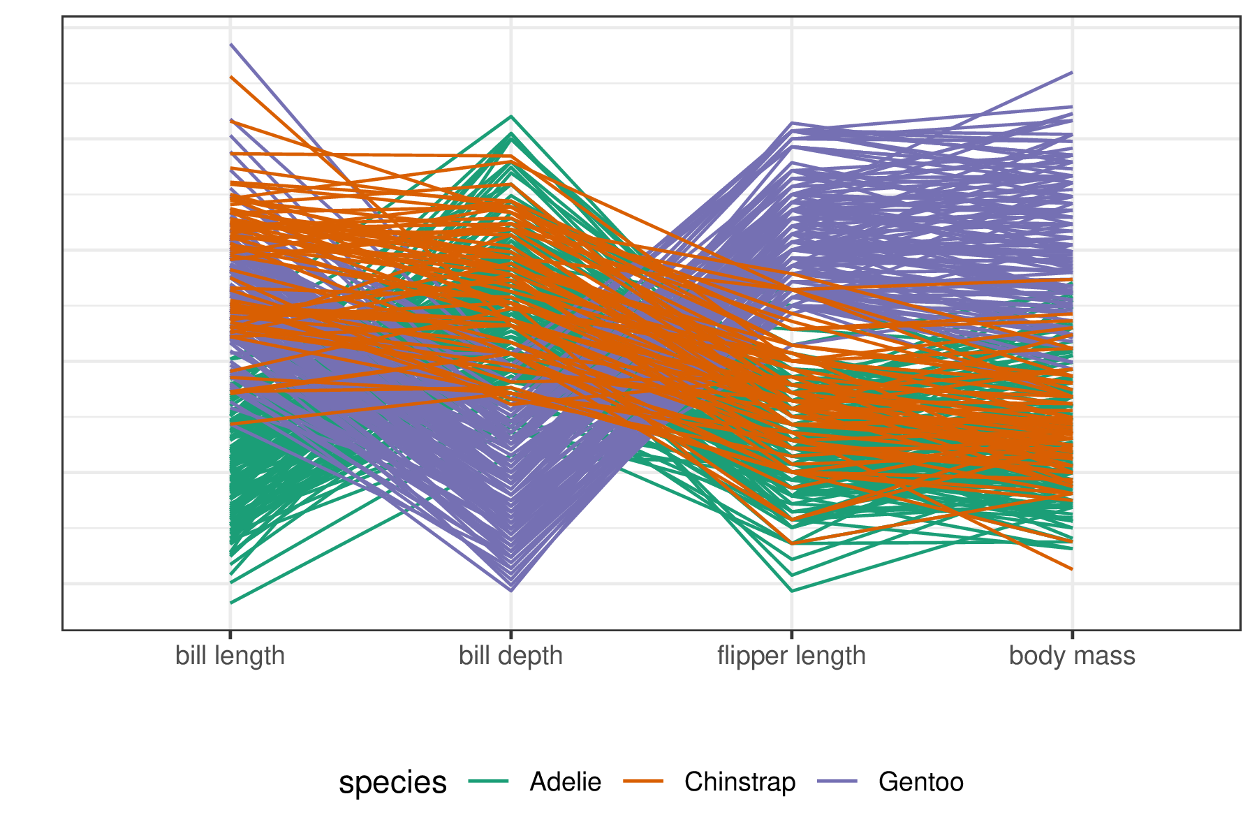
Figure 2.3: Parallel coordinate plots put variables on a common scale and position them side-by-side with lines connecting observations. Some cluster variation can be seen, corroborating their importance in explaining cluster separation. This approach scales relatively well with the number of variables but poorly with the number of observations.
The same issues persist across displays that map observations into \(n\) glyphs or pixel heatmaps. Examples of these include star plots (Chambers et al. 1983), pixel-based visuals (Keim 2000), and Chernoff faces (Chernoff 1973). Similar to parallel coordinate plots, these other visuals scale quite poorly with increasing observations. However, because these visuals scale well with the number of variables, they may be candidate visualizations for low \(n\) and high \(p\) data.
2.2.3 Dimension reduction
The other main approach for visualizing quantitative multivariate data is dimension reduction. This involves a function mapping \(p\)-space onto a lower \(d\)-dimensional space. Dimension reduction is separated into two categories, linear and nonlinear. The linear case spans all affine mathematical transformations, essentially any function where parallel lines stay parallel. Nonlinear transformations complement the linear case, think transformations containing exponents or interacting terms.
Examples in low dimensions are relatable. For instance, shadows are linear projections of a 3-dimensional object down to a 2D shadow. Linear perspective drawings are another instance. An example of a nonlinear transformation is that of 2D maps of the globe. A common example is the Mercator projection, a rectangular display where the area is proportionally distorted with the distance away from the equator (Snyder 1987). Other distortions are created when the surface is unwrapped into an elongated ellipse. Yet others create non-continuous gaps on land or oceans to minimize the distortion of targeted areas. Snyder lists over 200 different projections that distort the surface to display as a map, each with unique properties. However, despite familiarity with map projections, users find it difficult to understand the distortions they introduce (Hennerdal 2015).
As illustrated by map projections, nonlinear projections can be challenging to understand. Various computational quality metrics, such as Trustworthiness, Continuity, Normalized stress, and Average local error, have been introduced to describe the distortion of the space (Venna and Kaski 2006; Maaten et al. 2009; Gracia et al. 2016; Espadoto et al. 2021). To quote Panagiotelis (2020), “All nonlinear projections are wrong, but some are useful,” a play on George Box’s quote about models (“All models are wrong, but some are useful,” Box 1976).
Furthermore, nonlinear projections have hyperparameters (absent from linear methods) that control how the spaces are distorted to fit into fewer dimensions. These introduce a degree of subjectivity into the resulting projection. Opinions differ on how to best deal with hyperparameters. Probst et al. (2019b) discuss tuning strategies. Others compare implementation default values (Gijsbers et al. 2021; Pfisterer et al. 2021). Probst et al. (2019a) look at the sensitivity of hyperparameters to the performance of a model. Automated machine learning takes a programmatic approach to hyperparameter tuning (Feurer et al. 2015; Hutter et al. 2019; Yao et al. 2019). Due to the difficulty of interpreting nonlinear mappings and the added subjectivity of hyperparameter selection, this thesis focuses on linear visualization techniques.
2.2.4 Intrinsic data dimensionality
One way dimension reduction is used is to project multivariate data onto 1-, 2-, or 3D space and visualize the results. However, it can also be used as a preprocessing step for analysis in \(d\)-dimensions. The intrinsic dimensionality of data is the number of variables needed to minimally represent the data (Grinstein et al. 2002). Intrinsic data dimensionality is an essential consideration of dimension reduction. Consider a Psychology survey consisting of 100 questions about the Big Five personality traits. The data consists of 100 response variables, while the theory would suggest the intrinsic dimensionality is five. Thus, it makes sense to project onto five dimensions and analyze and visualize this embedded space rather than the original space. This mitigates the exponentially increasing volume of the view space and the computational load with minimal information loss.
2.3 Linear projections
Let data, \(X\), contain \(n\) observations of \(p\) variables. A linear projection maps a higher \(p\)-dimensional space onto a smaller \(d\)-space with an affine mapping (where parallel lines stay parallel). A projection, \(Y\), is the resulting space of the data multiplied by a basis, \(A\), such that \(Y_{n \times d} = X_{n \times p} \times A_{p \times d}\). This is an orthonormal matrix that explains the orientation and magnitudes that variables contribute to the resulting space. This basis is often illustrated as a biplot (Gabriel 1971), where variable contributions are inscribed in a unit circle showing the direction and the magnitude of contribution as presented in the previous chapter and Figure 2.4.
A standard linear projection is principal component analysis (PCA, Pearson 1901), which creates a component space ordered by descending variation. It uses eigenvalue decomposition to identify the basis. These components are typically viewed as discrete orthogonal pairs, commonly approximated as several components. The exact number of components to keep is subjective but typically guided by a scree plot (Cattell 1966). Scree plots illustrate the decreasing variation contained in subsequent components. The analyst then identifies an “elbow” in this plot. PCA is also commonly used in preprocessing to reduce the number of dimensions to embed the data in a space corresponding to the intrinsic dimensionality.
2.3.1 Tours, animated linear projections
In a static linear projection, there is only one basis. However, a single projection may not reveal the structure of interest. In contrast, a data visualization tour shows multiple projections by animating between small changes in the basis. In the shadow analogy, structural information of an object is gained by watching its shadow change due to its rotation. An analyst similarly gains structural information by watching a continuous projection over changes to the basis (essentially a rotation of the data). There are various types of tours that are classified by the generation of their basis paths. We enumerate a few related to this work. A more comprehensive discussion and review of tours can be found in the works of Cook et al. (2008) and Lee et al. (2021).
Regardless of the type of tour, they generate a sequence of target bases, and then the tour must interpolate intermediate bases between consecutive bases. This interpolation is performed along a geodesic path between the bases. Geodesic refers to the shortest path (on a \(p\)-sphere of possible bases). This ends up being slightly curved in 2D representation for the same reason that flight paths appear curved on maps. The interpolation of bases at small enough angles is foundational for the trackability of observations between frames.
Originally in a grand tour (Asimov 1985), several target bases are randomly selected. Figure 2.4 illustrates six frames of a grand tour. The grand tour is suitable for exploratory data analysis. It will show bases with widely varying contributions but lacks a means of steering the tour and controlling the choice of bases.
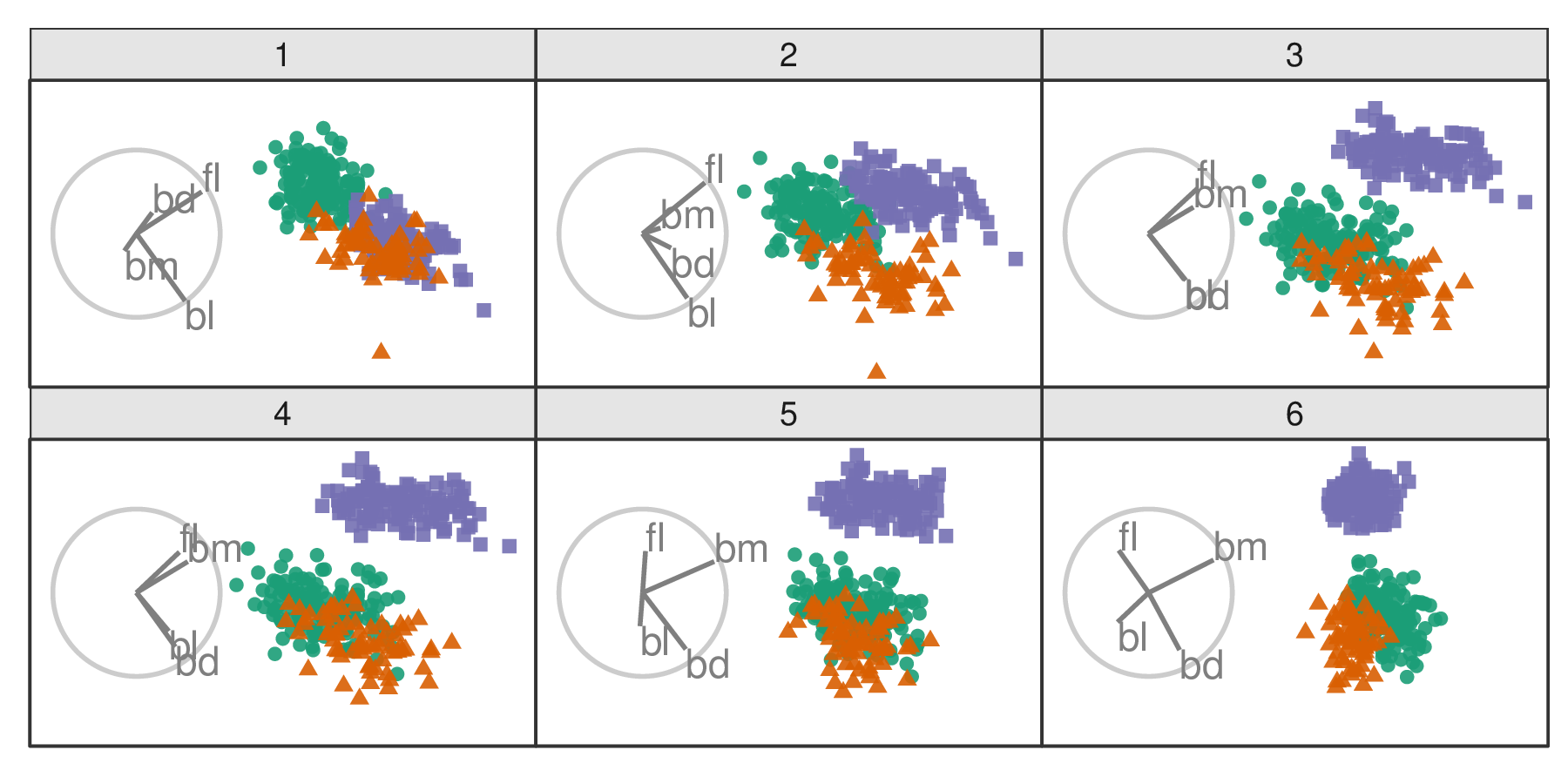
Figure 2.4: Frames from a grand tour. Biplots (grey circles) illustrate the direction and magnitude that variables contribute. In the grand tour, target bases are selected randomly. Tours animate linear projections over small changes in the basis. The permanence of observations between frames is an essential distinction in tours. An animation can be viewed at vimeo.com/676723441.
In contrast, the manual tour (Cook and Buja 1997) allows the analyst to change the contribution of a selected variable. It does so by initializing a manipulation dimension on a 1- or 2D projection which can then be rotated to alter the contribution of a selected variable. This work focuses on the radial tour sub-variant. The contribution angle is fixed, and the magnitude of contribution varies along the radius, as illustrated in the biplot display. We saw an example of this in Figure 1.2.
Figure 2.5 illustrates the same radial tour shown in the previous chapter across three geometric displays designed to overcome occlusion issues when there are many observations. The use of density contours and aggregated heatmap displays help to mitigate the occlusion of dense observations and is compatible with any scatterplot display.
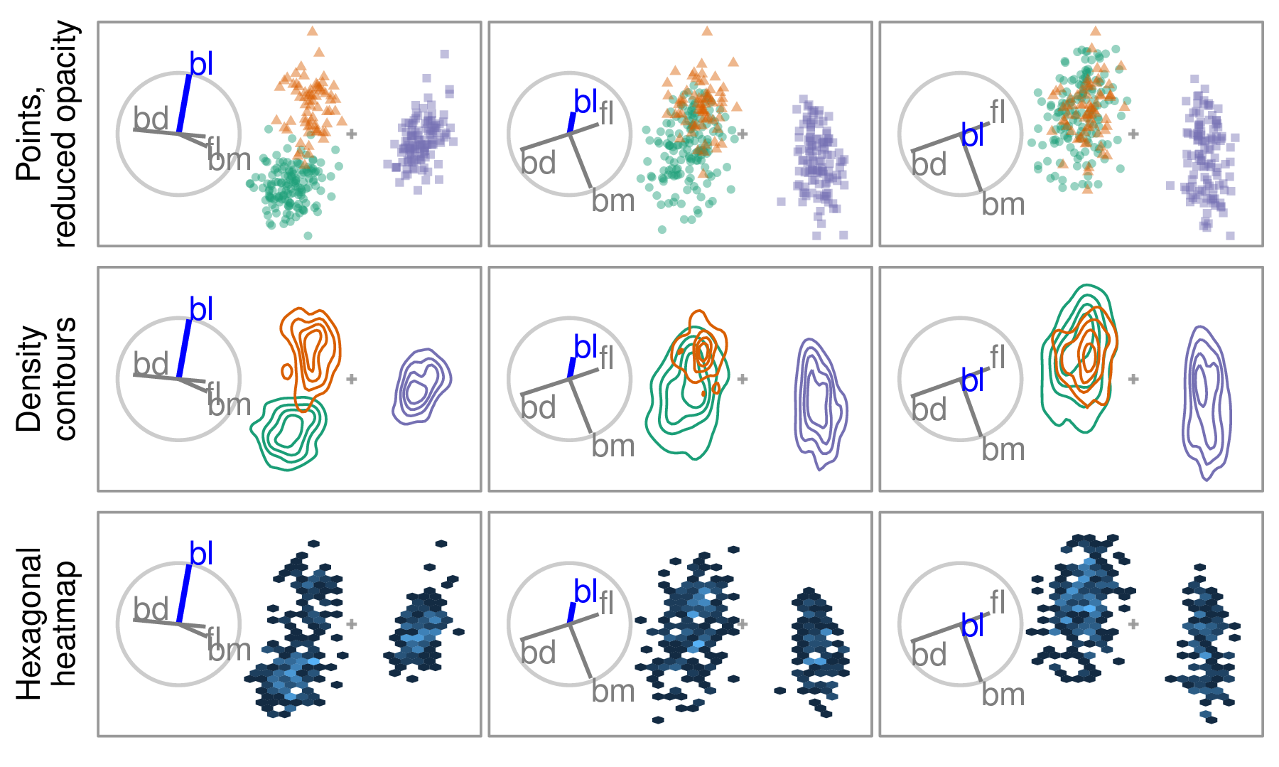
Figure 2.5: Radial tour across three geometric displays. Changing the point opacity or geometric display to density contours or aggregated heatmap are common ways to mitigate occlusion caused by dense observations. The radial tour removes the contribution of bl and consequently the separation between the orange and green clusters. A heatmap display is not the best choice to show supervised cluster separation but can be helpful to see structure in dense data.
2.4 Evaluating multivariate data visualization
Definitions and surveys of quality metrics for the distortion of nonlinear reduction are given by Bertini et al. (2011). The latest, most comprehensive quantitative surveys are discussed by Espadoto et al. (2021) and Nonato and Aupetit (2018). The former compares 44 dimension reduction techniques across 18 datasets over seven metrics. While the former papers mention tours, they are absent from quantitative surveys.
Some studies compare visualizations across complete contributions of variables. Chang et al. (2018) conducted an \(n=51\) participant study comparing parallel coordinate plots and SPLOM either in isolation, sequentially, or as a coordinated view. Accuracy and completion time were measured for six tasks. Three tasks were more accurate with SPLOM and three with parallel coordinates. In comparison, the coordinated view was usually marginally more accurate than the max of the separate visuals. Cao et al. (2018) compare unstandardized line-glyph and star-glyphs with standardized variants (with and without curve fill). Each of the \(n=18\) participants performs 72 trials across the six visuals, two levels of dimensions, and two levels of observations. Visuals with variable standardization outperform the unstandardized variants, and the radial star-glyph reportedly outperformed the line-variant.
Other studies have investigated the relative benefits of projecting to 2- or 3D scatterplots in PCA-reduced spaces. Gracia et al. (2016) conduct an \(n=40\) user study comparing 2- and 3D scatterplots on traditional 2D monitors. Participants perform point classification, distance perception, and outlier identification tasks. The results are mixed and primarily have small differences. There is some evidence to suggest a lower error in distance perception from a 3D scatterplot. Wagner Filho et al. (2018) perform an \(n=30\) within participants study on PCA reduced space using scatterplot displays between 2D on monitors, 3D on monitors, and 3D display with a head-mounted display. None of the tasks on any dataset lead to a significant difference in accuracy. However, the immersive display reduced effort and navigation, resulting in higher perceived accuracy and engagement.
Some studies use expert or cohort coding. Sedlmair et al. (2013) instead use two expert coders to evaluate 75 datasets and four dimension reduction techniques across 2D scatterplots, 2D scatterplot matrices, and interactive 3D scatterplots. They suggest a tiered guidance approach finding that 2D scatterplots are often sufficient to resolve a feature. If not, try an alternative dimension reduction technique before going to scatterplot matrix display or concluding a true negative. They find that interactive 3D scatterplots help in relatively rare cases. Lewis et al. (2012) compare three cohorts: experts, uninformed novices, and informed novices (\(n=5+15+16=36\)). Participants were asked their opinion of the quality of nine different embedding for each data set. Expert opinion is reportedly more consistent than the novice groups, though the different sample sizes confound this. Interestingly, cohort responses correlated with different quality metrics. Positive ratings from the expert group correlated strongest with the Trustworthiness metric.
Tours are absent from studies calculable quality measures. However, Nelson et al. (1998) compare scatterplots of grand tours on a 2D monitor with a 3D display (stereoscopic, not head-mounted) over \(n=15\) participants. Participants perform clusters detection, dimensionality, and radial sparseness tasks on six-dimensional data. They find that stereoscopic 3D leads to more accuracy for cluster identification, though interaction time greatly increased in the 3D case.
2.5 Nonlinear models
So far, the thesis has focused on exploratory data analysis. Another core part of data analysis is fitting regression models of quantitative data (Galton 1886) and classification models for discrete categories (Fisher 1935). There are different reasons and emphases when considering to fit a model. Breiman (2001b), reiterated by Shmueli (2010), taxonomize models based on their purpose. Explanatory modeling is done for some inferential purpose, while predictive modeling focuses more narrowly on the performance of some objective function. The intended use has important implications for model selection and development. In explanatory modeling, interpretability is vital for drawing inferential conclusions. Nonlinear models range from additive models with at least one polynomial term to more complex machine learning models such as random forests, support-vector machines, or neural networks, to name a few (Boser et al. 1992; Anderson 1995; Breiman 2001a).
Nonlinear models have many or complex interactive terms, which cause an opaqueness to the interpretation of the variables. This difficulty in interpreting the terms in complex nonlinear models sometimes leads to them being referred to as black box models. Despite the potentially better performance of nonlinear models, their use is not without controversy (O’Neil 2016; Kodiyan 2019). And the loss of interpretation presents a challenge.
Interpretability is vital for exploring and protecting against potential biases in any model. E.g., bias against sex (Dastin 2018; Duffy 2019), race (Larson et al. 2016), and age (Díaz et al. 2018). For instance, models regularly pick up on biases in the training data where such classes correlate with changes in the response variable. This bias is then built into the model. Variable-level (feature-level) interpretability of models is essential in evaluating and addressing such biases.
Another concern is data drift, where a shift in the range of the explanatory variables (features or predictors). Some nonlinear models are sensitive to this and do not extrapolate well outside the support of the training data (Espadoto et al. 2021). Maintaining variable interpretability is also essential to address issues arising from data drift.
2.6 Local explanations
Explainable Artificial Intelligence (XAI) is an emerging field of research that aims to increase the interpretability of nonlinear models (Adadi and Berrada 2018; Arrieta et al. 2020). A common approach is local explanations, which attempt to approximate linear variable importance in the vicinity of one observation (instance). This is a linear measure indicating which variables are essential for distinguishing between the mean of the data and the prediction near one observation. Because these are point-specific, the challenge is to comprehensively visualize them to better understand a model.
Consider a highly nonlinear model. It can be hard to determine which variables in the data are sensitive to changes in the classification or sizable changes in a residual. Local explanations shed light on these situations by approximating linear variable importance in the vicinity of a single observation. Figure 2.6 motivates local explanations where the analyst wants to know the variable attribution for a particular observation close to the classification boundary in a nonlinear model.
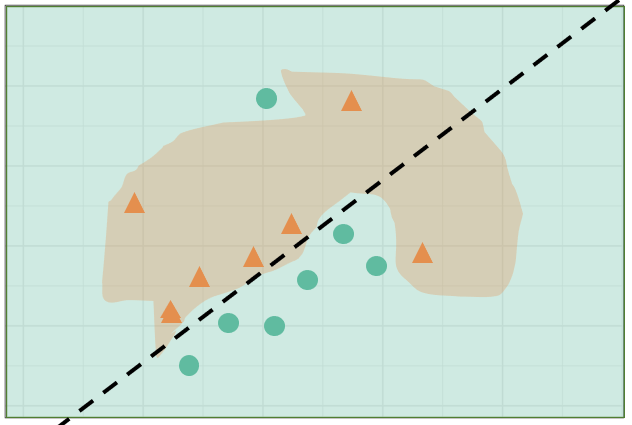
Figure 2.6: Illustration of a nonlinear classification model. An analyst may want to know the variable importance if an observation is precariously close to the classification boundary. Local explanations approximate this linear attribution in the vicinity of one observation.
A comprehensive summary of the taxonomy and literature on explanation techniques is provided in Figure 6 (Arrieta et al. 2020). It includes a large number of model-specific explanations, such as deepLIFT (Shrikumar et al. 2016, 2017), a popular recursive method for estimating importance in neural networks. There are fewer model-agnostic explanations, of which LIME, (Ribeiro et al. 2016) SHAP, (Lundberg and Lee 2017), and their variants are popular.
These observation-level explanations are used in various ways depending on the context. In image classification, a saliency map indicates the necessary pixels for the resulting classification (Simonyan et al. 2014). For example, snow may be highlighted when distinguishing if a picture contains a wolf or husky (Besse et al. 2019). In text analysis, word-level contextual sentiment analysis can highlight the sentiment and magnitude of influential words (Vanni et al. 2018). In the case of numeric regression, they are used to explain variable additive contributions from the observed mean to the observation’s prediction (Ribeiro et al. 2016).
2.7 Conclusion
This chapter discussed the motivation for data visualization, which conveys more information than statistic summarization alone. User interaction is important for linking observation and auxiliary information between coordinated views and animation frames. Several visuals were discussed before turning to dimension reduction. Because of the opaqueness of the distortions and the added subjectivity from nonlinear dimension reduction, this thesis focused more on viewing many linear projections. In particular, over the changing basis of tours and the user-control steering of the basis radial tour are of specific interest.
Metric and empirical evaluations of multivariate data were discussed. Nonlinear models and XAI’s use of local explanations to extend the interpretability of models were also covered. There is an absence of studies comparing animated tours with alternative visualizations.
The following chapters respectively address the three research questions covered in the Introduction. Chapter 3 discusses the implementation of a package that facilitates the creation of radial tours and extends the display and exporting of tours in general. Chapter 4 covers the first user study evaluating the radial tour compared with two common alternatives. Chapter 5 introduces a novel analysis that explores local explanations of nonlinear models with the radial tour.