Chapter 5 Exploring Local Explanations of Nonlinear Models Using the Radial tour
The previous chapter discussed the within-participants user study comparing PCA, the grand tour, and the radial tour in a supervised variable attribution task. There was strong evidence that the radial tour led to a large increase in accuracy. The analyst can be more confident that the radial tour leads to a better analysis of variable-level attribution to variables identified in a projection.
Given the interpretability crisis of nonlinear models, it would be interesting to see if the radial tour can help. Specifically, this chapter investigates using the radial tour to explore variable sensitivity to the structure identified in linear local explanations of nonlinear models. That is, under what range of variable importance does an explanation make sense, and what contributions fail to support the prediction. This can be used to examine which variables lead to the misclassification of observation or an extreme residual. The radial tour can also test how susceptible a variable’s contribution is to discerning the predictions of two observations. This is a novel analysis and corresponding visuals that extend the analyst’s ability to interpret the variable contributions of a nonlinear model.
The increased predictive power of nonlinear models comes at the cost of interpretability of its terms. This trade-off has led to the emergence of eXplainable AI (XAI). XAI attempts to shed light on how models use predictors to arrive at a prediction with local explanations, a point estimate of the linear variable importance in the vicinity of one observation. These can be considered linear projections and can be further explored to understand better the interactions between variables used to make predictions across the predictive model surface. Here we describe interactive linear interpolation used to examine the explanation of any observation and illustrate with examples with categorical (penguin species, chocolate types) and quantitative (soccer/football salaries, house prices) output. The methods are implemented in the R package cheem, available on CRAN.
Chapter 2 introduced predictive modeling, the interpretability crisis of nonlinear models, and local explanations — approximations of linear variable importance in the vicinity of one observation. The remainder of this chapter is organized as follows. Section 5.1 induces the SHAP and tree SHAP local explanation. Section 2.3.1 explains the animations of continuous linear projections. Section 5.2 discusses the visual layout in the graphical user interface, how it facilitates analysis, data preprocessing, and package infrastructure. Then Section 5.3 illustrates the application to supervised learning with categorical and quantitative output. Section 5.4 concludes with the insights gained and possible directions to explore in the future.
5.1 SHAP and tree SHAP local explanations
SHaply Additive exPlanations (SHAP) quantifies the variable contributions of one observation by examining the effect of other variables on the predictions. The explanations of SHAP refer to Shapley (1953)’s method to evaluate an individual’s contribution to cooperative games by assessing this player’s performance in the presence or absence of other players. Strumbelj and Kononenko (2010) introduce SHAP for local explanations in machine learning models. The attribution of variable importance depends on the sequence of the included variables. The SHAP values are the mean contributions over different variable sequences. The approach is related to partial dependence plots (Molnar 2020), used to explain the effect of a variable by predicting the response for a range of values on this variable after fixing the value of all other variables to their mean. However, partial dependence plots are a global approximation of the variable importance, while SHAP is specific to one observation. Local explanations could also be considered similar to examining the coefficients from all subsets regression, as described by Wickham et al. (2015), which helps to understand the relative importance of each variable in the context of all other candidate variables.
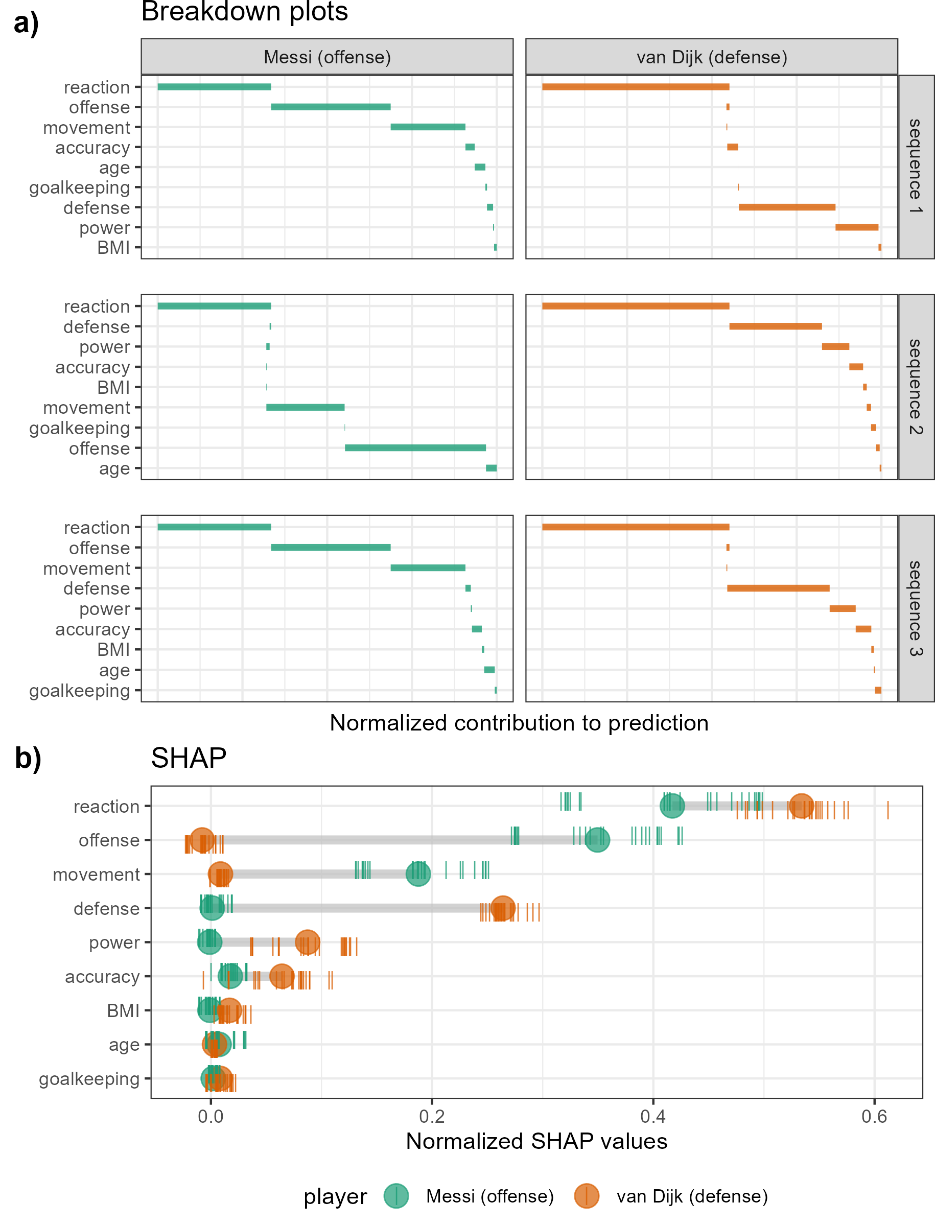
Figure 5.1: Illustration of SHAP values for a random forest model FIFA 2020 player wages from nine skill predictors. A star offensive and defensive player are compared, L. Messi and V. van Dijk, respectively. Panel (a) shows breakdown plots of three sequences of the variables. The sequence of the variables impacts the magnitude of their attribution. Panel (b) shows the distribution of attribution for each variable across 25 sequences of predictors, with the mean displayed as a dot for each player. Reaction skills are important for both players. Offense and movement are important for Messi but not van Dijk, and conversely, defense and power are important for van Dijk but not Messi.
Following the use case Explanatory Model Analysis (Biecek and Burzykowski 2021), FIFA data is used to illustrate SHAP. Consider soccer data from the FIFA 2020 season (Leone 2020). There are 5000 observations of 9 skill measures (after aggregating highly correlated variables). A random forest model is fit regressing player’s wages [2020 Euros] from their skill measurements. The SHAP values are compared for a star offensive player (L. Messi) and a defensive player (V. van Dijk). The results are displayed in Figure 5.1. A difference in the attribution of the variable importance across the two positions of the players can be expected. This would be interpreted as how a player’s salary depends on the combination of their skill sets. Panel (a) is a modified breakdown plot (Gosiewska and Biecek 2019) where three sequences of variables are presented, so the two observations can be more easily compared. The magnitude of the contributions depends on the sequence in which they appear. Panel (b) shows the differences of the player’s median values of over 25 such sequences. In summary, these plots highlight how local explanations bring interpretability to a model, at least in the vicinity of their observations. In this observation, two players with different positions receive different profiles of variable importance to explain the prediction of their wages.
For the application, we use tree SHAP, a variant of SHAP that enjoys a lower computational complexity (Lundberg et al. 2018). Instead of aggregating over sequences of the variables, tree SHAP calculates observation-level variable importance by exploring the structure of the decision trees. Tree SHAP is only compatible with tree-based models; random forests are used for illustration. The following section will use normalized SHAP values as a projection basis (call this the attribution projection) that will be used to explore the sensitivity of the variable contributions.
5.2 The cheem viewer
To explore the local explanations, coordinated views (Roberts 2007) (also known as ensemble graphics, Unwin and Valero-Mora 2018) are provided in the cheem viewer application. There are two primary plots. The global view was designed to provide the context for all observations for the data space, explanation attribution space, and residual plot. The radial tour view then examines a selected observation’s local explanations by varying basis contributions with user-controlled rotation. There are numerous user inputs, including variable selection for the radial tour and observation selection for making comparisons. There are different plots used for the categorical and quantitative responses. Figures 5.2 and 5.3 are screenshots showing the cheem viewer for the two primary tasks: classification (categorical response) and regression (quantitative response).
5.2.1 Global view
The global view provides a context of all observations and facilitates the exploration of the separability of the data- and attribution-spaces. Both of these spaces are of dimension \(n\times p\), where \(n\) is the number of observations and \(p\) is the number of predictors. The attribution space corresponds to the local explanations for each observation, each a vector of \(p\) values.
Visualization is provided by the first two principal components of the data (left) and the attribution (middle) spaces. These single 2D projections will not reveal all of the structure of higher-dimensional space, but they are helpful visual summaries. In addition, a plot of the observed against predicted response values is also provided (Figures 5.2b, 5.3a) to help identify observations poorly predicted by the model. For classification tasks, misclassified observations are circled in red. Linked brushing between the plots is provided, and a tabular display of selected points helps to facilitate exploration of the spaces and the model (shown in Figures 5.3d).
While the comparison of these spaces is interesting, the primary purpose of the global view is to enable the selection of observations to explore the local explanations. The projection attribution of the primary observation (PO) is examined and typically viewed with an optional comparison observation (CO). These observations are highlighted as asterisks and \(\times\), respectively.
5.2.2 Radial tour
The local explanations for all observations are normalized (squared sum of values adds to 1), and thus, the relative importance of variables can be compared across all observations. These are depicted as vertical parallel coordinate plots (Ocagne 1885) on the basis biplot (Gabriel 1971). 1D biplot display depicts the values of the current basis as bars. The parallel coordinate overlays lines connecting one observation’s variable attribution (Figures 5.2e and 5.3e). The attribution projections of the PO and CO are shown as dashed and dotted lines. From this plot, the range and density of the importance across all observations can be interpreted. For classification, one would look at differences between groups on any variable. For example, Figure 5.2e suggests that bl is important for distinguishing the green class from the other two. For regression, one might generally observe which variables have low values for all observations (unimportant), for example, BMI and pwr in Figure 5.3e, and which have a range of high and low values (e.g., off, def), suggesting they are important for some observations and not important for other observations.
The overlaid bars on the parallel coordinate plot represent the attribution projection of the PO. (Remember that the PO is interactively selected from the global view). The attribution projection approximates the variable importance for predicting this observation. This combination of variables best explains the difference between the mean response and an observation’s predicted value. It is not an indication of the local shape of the model surface. That is, it is not some indication of the tangent to the curve at this point.
The attribution projection of the PO is the initial 1D basis in a radial tour, displayed as a density plot for a categorical response (Figure 5.2f) and as scatterplots for a quantitative response (Figure 5.3f). The PO and CO are indicated by vertical dashed and dotted lines, respectively. The radial tour varies the contribution of the selected variable between 0-1. This is viewed as an animation of the projections from many intermediate bases. Doing so tests the sensitivity of structure (class separation or strength of relationship) to the variable’s contribution. For classification, if the separation between classes diminishes when the variable contribution is reduced, this suggests that the variable is important for class separation. For regression, if the relationship scatterplot weakens when the variable contribution is reduced, indicating that the variable is important for accurately predicting the response.
5.2.3 Classification task
Selecting a misclassified observation as PO and a correctly classified point nearby in data space as CO makes it easier to examine the variables most responsible for the error. The global view (Figure 5.2c) displays the model confusion matrix. The radial tour is 1D and displays as density where color indicates class. A slider enables the user to vary the contribution of a variable to explore the sensitivity of its contribution to the separation of classes.
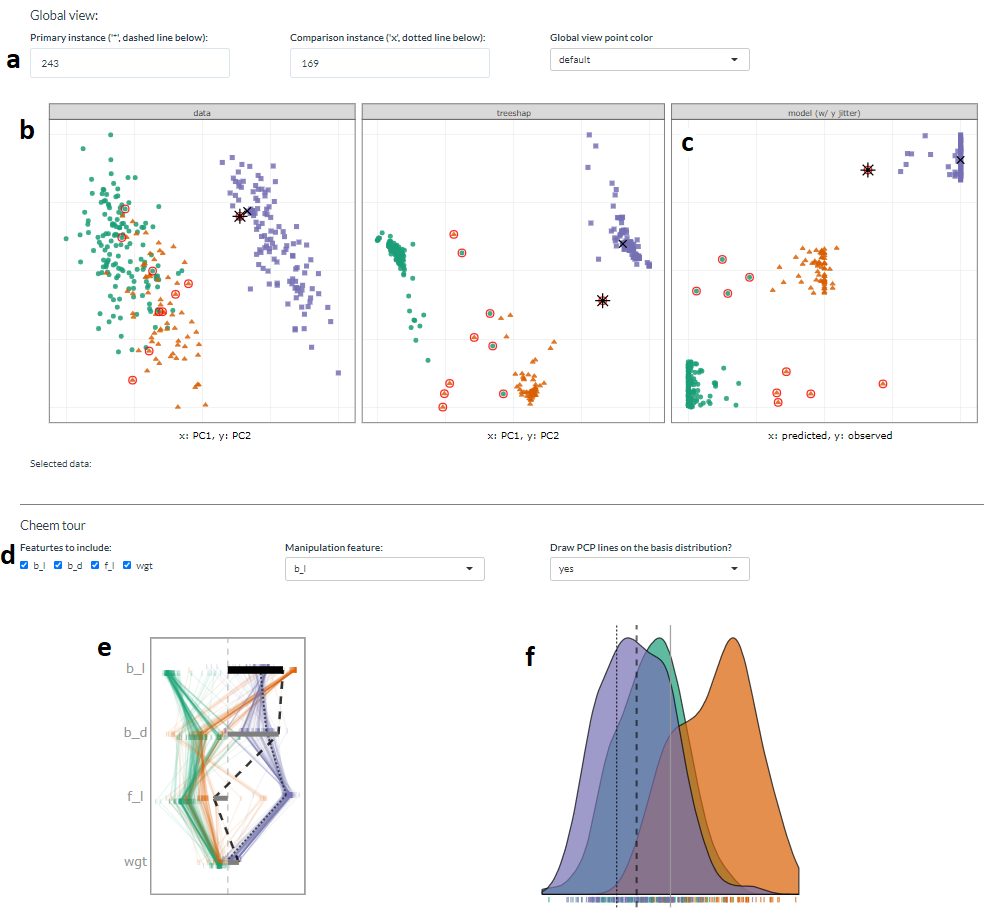
Figure 5.2: Overview of the cheem viewer for classification tasks. Global view inputs, (a), set the PO, CO, and color statistic. Global view, (b) PC1 by PC2 approximations of the data- and attribution-spaces. (c) prediction by observed y (visual of the confusion matrix for classification tasks). Points are colored by predicted class, and red circles indicate misclassified observations. Radial tour inputs (d) select variables to include and which variable is changed in the tour. (e) shows a parallel coordinate display of the distribution of the variable attributions while bars depict contribution for the current basis. The black bar is the variable being changed in the radial tour. Panel (f) is the resulting data projection indicated as density in the classification case.
5.2.4 Regression task
Selecting an inaccurately predicted observation as PO and an accurately predicted observation with similar variable values as CO is a helpful way to understand how the model is failing or not. The global view (Figure 5.3a) shows a scatterplot of the observed vs predicted values, which should exhibit a strong relationship if the model is a good fit. The points can be colored by a statistic, residual, a measure of outlyingness (log Mahalanobis distance), or correlation to aid in understanding the structure identified in these spaces.
In the radial tour view, the observed response and the residuals (vertical) are plotted against the attribution projection of the PO (horizontal). The attribution projection can be interpreted similarly to the predicted value from the global view plot. It represents a linear combination of the variables, and a good fit would be indicated when there is a strong relationship with the observed values. This can be viewed as a local linear approximation if the fitted model is nonlinear. As the contribution of a variable is varied, if the value of the PO does not change much, it would indicate that the prediction for this observation is NOT sensitive to that variable. Conversely, if the predicted value varies substantially, the prediction is very sensitive to that variable, suggesting that the variable is very important for the PO’s prediction.
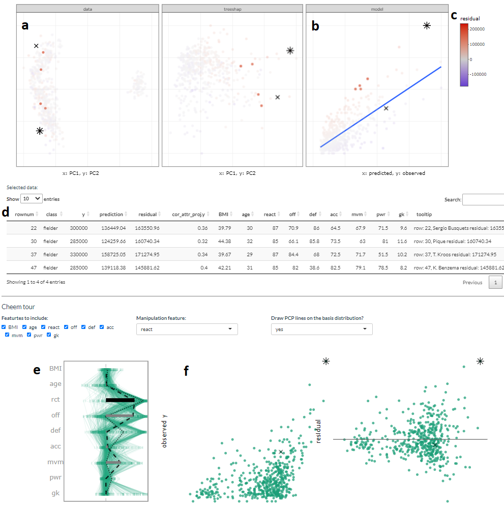
Figure 5.3: Overview of the cheem viewer for regression and illustration of interactive variables. Panel (a) PCA of the data and attributions spaces, (b) residual plot, predictions by observed values. Four selected points are highlighted in the PC spaces and tabularly displayed. Coloring on a statistic (c) highlights structure organized in the attribution space. Interactive tabular display (d) populates when observations are selected. Contribution of the 1D basis affecting the horizontal position (e) parallel coordinate display of the variable attribution from all observations, and horizontal bars show the contribution to the current basis. Regression projection (f) uses the same horizontal projection and fixes the vertical positions to the observed y and residuals (middle and right).
5.2.5 Interactive variables
The application has several reactive inputs that affect the data used, aesthetic display, and tour manipulation. These reactive inputs make the software flexible and extensible (Figure 5.2a & d). The application also has more exploratory interactions to help link points across displays, reveal structures found in different spaces, and access the original data.
A tooltip displays observation number/name and classification information while the cursor hovers over a point. Linked brushing allows the selection of points (left click and drag) where those points will be highlighted across plots (Figure 5.2a & b). The information corresponding to the selected points is populated on a dynamic table (Figure 5.2d). These interactions aid exploration of the spaces and, finally, the identification of primary and comparison observations.
5.2.6 Preprocessing
It is vital to mitigate the render time of visuals, especially when users may want to iterate many explorations. All computational operations should be prepared before runtime. The work remaining when an application is run solely reacts to inputs and rendering visuals and tables. Below discusses the steps and details of the reprocessing.
- Data: predictors and response are unscaled complete numerical matrix. Most models and local explanations are scale-invariant.
- Model: any model and compatible explanation could be explored with this method. Currently, random forest models are applied via the package randomForest (Liaw and Wiener 2002), compatibility tree SHAP. Modest hyperparameters are used, namely: 125 trees, number variables randomly sampled at each split, mtry = \(\sqrt{p}\) or \(p/3\) for classification and regression, and minimum size of terminal nodes \(max(1, n/500)\) or \(max(5, n/500)\) for classification and regression.
- Local explanation: Tree SHAP is calculated for each observation using the package treeshap (Kominsarczyk et al. 2021). This implementation aggregates exhaustively over all trees’ attribution and does not fit interactions of variables.
- Cheem viewer: after the model and full explanation space are calculated, each variable is scaled by standard deviations away from the mean to achieve common support for visuals. Statistics for mapping to color are computed on the scaled spaces.
The time to preprocess the data will vary significantly with the complexity of the model and local explanation. For reference, the FIFA data contains 5000 observations of nine explanatory variables and took 2.5 seconds to fit a random forest model of modest hyperparameters. Extracting the tree SHAP values of each observation took 270 seconds total. PCA and statistics of the variables and attributions took another 2.8 seconds. These runtimes were from a non-parallelized R session on a modern laptop, but suffice to say that most of the time will be spent on the local attribution. An increase in model complexity or data dimensionality will quickly become an obstacle. Its reduced computational complexity makes tree SHAP an excellent candidate to start. (Alternatively, the package fastshap (Greenwell 2020) claims extremely low runtimes, attributed to fewer calls to the prediction function, partial implementation in C++, and efficient use of logical subsetting.)
5.2.7 Package infrastructure
The above-described method and application are implemented as an open-source R package, cheem available on CRAN. Preprocessing was facilitated with models created via randomForest (Liaw and Wiener 2002) and explanations calculated with treeshap (Kominsarczyk et al. 2021). The application was made with shiny (Chang et al. 2021). The tour visual is built with spinifex (Spyrison and Cook 2020). Both views are created first with ggplot2 (Wickham 2016) and then rendered as interactive html widgets with plotly (Sievert 2020). DALEX (Biecek 2018) and the free ebook, Explanatory Model Analysis (Biecek and Burzykowski 2021) were a boon to understanding local explanations and how to apply them.
5.2.8 Installation and getting started
The package can be installed from GitHub using the following R code:
install.packages("cheem", dependencies = TRUE)
library("cheem")
run_app()
Alternatively,
- a version of the cheem viewer shiny app can be directly accessed at ebsmonash.shinyapps.io/cheem_initial/.
- the development version of the package is available at https://github.com/nspyrison/cheem, and
- documentation of the package can be found at https://nspyrison.github.io/cheem/.
Follow the examples provided with the package to compute the local explainers (using ?cheem_ls). The application expects the output returned by cheem_ls(), saved to an rds file with saveRDS(), to be uploaded.
5.3 Case studies
To illustrate the cheem method, it is applied to modern datasets: two classification examples and then two regression.
5.3.1 Palmer penguin, species classification
The penguins data was introduced in the Introduction and Background. This data contains 333 observations of four physical measurements, bill length (bl), bill depth (bd), flipper length (fl), and body mass (bm). A random forest model was fit with species as the response variable. Tree SHAP values were calculated for every observation.
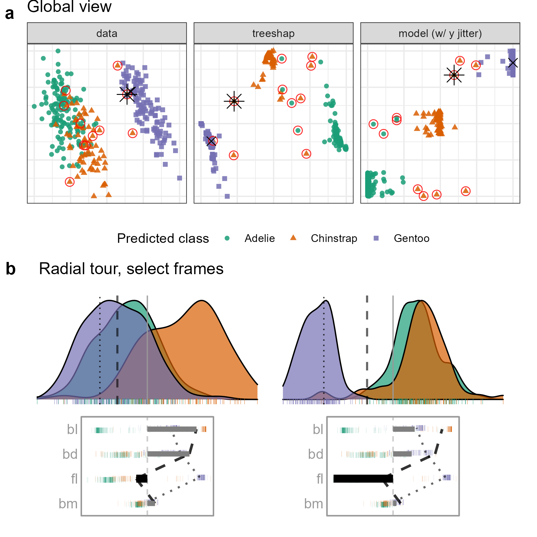
Figure 5.4: Examining the tree SHAP values for a random forest model classifying Palmer penguin species. The PO is a Gentoo (purple) penguin that is misclassified as a Chinstrap (orange), marked as an asterisk in (a), and the dashed vertical line in (b). The radial view shows varying the contribution of fl from the initial attribution projection (b, left), which produces a linear combination where the PO is more probably (higher density value) a Chinstrap than a Gentoo (b, right). (The animation of the radial tour is at vimeo.com/666431172.)
Figure 5.4 shows plots from the cheem viewer for exploring the random forest model on the penguins data. Panel (a) shows the global view, and panel (b) shows several 1D projections generated with the radial tour. Penguin 243, a Gentoo (purple), is the PO because it has been misclassified as a Chinstrap (orange).
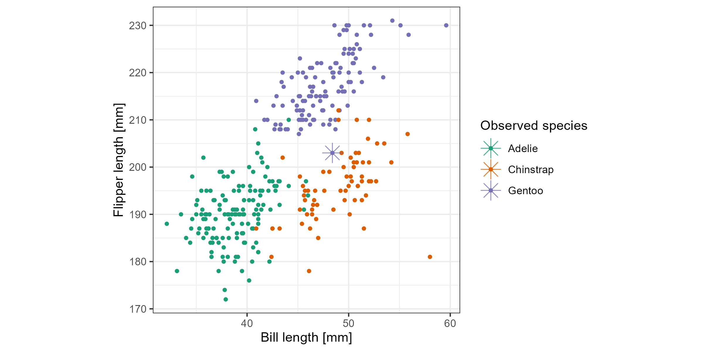
Figure 5.5: Checking what is learned from the cheem viewer. This is a plot of flipper length (fl) and bill length (bl) with an asterisk highlighting the PO. A Gentoo (purple) penguin was misclassified as a Chinstrap (orange). The PO has an unusually small fl length which is why it is confused with a Chinstrap.
There is more separation visible in the attribution space than in the data space, as would be expected. The predicted vs observed plot reveals a handful of misclassified observations. A Gentoo that has been wrongly labeled as a Chinstrap is selected for illustration. The PO is a misclassified point (represented by the asterisk in the global view and a dashed vertical line in the tour view). The CO is a correctly classified point (represented by an \(\times\) and a vertical dotted line).
The radial tour starts from the attribution projection of the misclassified observation (b, left). The important variables identified by SHAP in the (wrong) prediction for this observation are mostly bl and bd with small contributions of fl and bm. This projection is a view where the Gentoo (purple) looks much more likely for this observation than Chinstrap. That is, this combination of variables is not particularly useful because the PO looks very much like other Gentoo penguins. The radial tour is used to vary the contribution of flipper length (fl) to explore further. (In our exploration, this was the third variable explored. It is typically helpful to explore the variables with more significant contributions, here bl and bd. Still, when doing this, nothing was revealed about how the PO differed from other Gentoos). On varying fl as it contributes increasingly to the projection (b, right), more and more, this penguin looks like a Chinstrap. This suggests that fl should be considered an important variable for explaining the (wrong) prediction.
Figure 5.5 confirms that flipper length (fl) is vital for the confusion of the PO as a Chinstrap. Here, flipper length and body length are plotted. The PO can be seen to be closer to the Chinstrap group in these two variables, mainly because it has an unusually low value of flipper length relative to other Gentoos. From this view, it makes sense that it is a hard observation to account for, as decision trees can only partition only vertical and horizontal lines.
5.3.2 Chocolates, milk/dark chocolate classification
The chocolates dataset consists of 88 observations of ten nutritional measurements determined from their labels and labeled as either milk or dark. Dark chocolate is considered healthier than milk. The data were collected by students during the Iowa State University class STAT503 from nutritional information from the manufacturer’s website and normalized to 100g equivalents. The data is available in the cheem package. A random forest model is used for the classification of chocolate types.
It could be interesting to examine the nutritional properties of any dark chocolates that have been misclassified as milk. A reason to do this is that dark chocolate, nutritionally more like milk, should not be considered a healthy alternative. It is interesting to explore which nutritional variables contribute most to misclassification.
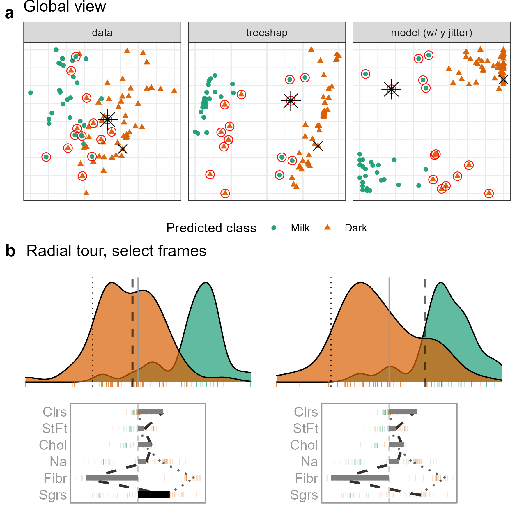
Figure 5.6: Examining the local explanation for a PO which is dark (orange) chocolate incorrectly predicted to be milk (green). From the attribution projection, this chocolate correctly looks more like dark than milk, which suggests that the local explanation does not help understand the prediction for this observation. So, the contribution of Sugar is varied — reducing it corresponds primarily with increasing Fiber. When Sugar is zero, Fiber contributes strongly towards the left. In this particular view, the PO is closer to the bulk of the milk chocolates, suggesting that the prediction put a lot of importance on Fiber. This chocolate is a rare dark chocolate without any Fiber leading to it being mistaken for a milk chocolate. (A video of the tour animation can be found at vimeo.com/666431143.)
This type of exploration is shown in Figure 5.6, where a chocolate labeled dark but predicted to be milk is chosen as the PO (observation 22). It is compared with a CO that is a correctly classified dark chocolate (observation 7). The PCA plot and the tree SHAP PCA plots (a) show a big difference between the two chocolate types but with confusion for a handful of observations. The misclassifications are more apparent in the observed vs predicted plot and can be seen to be mistaken in both ways: milk to dark and dark to milk.
The attribution projection for chocolate 22 suggests that Fiber, Sugars, and Calories are most responsible for its incorrect prediction. The way to read this plot is to see that Fiber has a large negative value, while Sugars and Calories have reasonably large positive values. In the density plot, observations on the very left of the display would have high values of Fiber (matching the negative projection coefficient) and low values of Sugars and Calories. The opposite would be interpreting a point with high values in this plot. The dark chocolates (orange) are primarily on the left, and this is a reason why they are considered to be healthier: high Fiber and low Sugar. The density of milk chocolates is further to the right, indicating that they generally have low Fiber and high Sugar.
The PO (dashed line) can be viewed against the CO (dotted line). Now, one needs to pay attention to the parallel plot of the SHAP values, which are local to a particular observation, and the density plot, which is the same projection of all observations as specified by the SHAP values of the PO. The variable contributions to the two different predictions can be quickly compared in the parallel coordinate plot. The PO differs from the comparison primarily on the Fiber variable, which suggests that this is the reason for the incorrect prediction.
From the density plot, which is the attribution projection corresponding to the PO, both observations are more like dark chocolates. Varying the contribution of Sugars and altogether removing it from the projection is where the difference becomes apparent. When primarily Fiber is examined, observation 22 looks more like milk chocolate.
It would also be interesting to explore an inverse misclassification. In this case, a milk chocolate is selected while it was misclassified as dark chocolate. Chocolate 84 is just this case and is compared with a correctly predicted milk chocolate (observation 71). The corresponding global view and radial tour frames are shown in Figure 5.7.
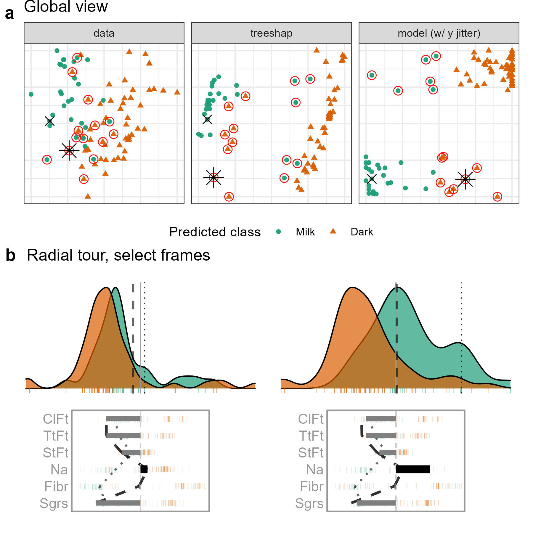
Figure 5.7: Examining the local interpretation for a PO which is milk (green) chocolate incorrectly predicted to be dark (orange). In the attribution projection, the PO could be either milk or dark. Sodium and Fiber have the largest differences in attributed variable importance, with low values relative to other milk chocolates. The lack of importance attributed to these variables is suspected of contributing to the mistake, so the contribution of Sodium is varied. If Sodium had a larger contribution to the prediction (like in this view), the PO would look more like other milk chocolates. (A video of the tour animation can be found at vimeo.com/666431148.)
The difference of position in the tree SHAP PCA with the previous case is quite significant; this gives a higher-level sense that the attributions should be quite different. Looking at the attribution projection, this is found to be the case. Previously, Fiber was essential while it is absent from the attribution in this case. Conversely, Calories from Fat and Total Fat have high attributions here, while they were unimportant in the preceding case.
Comparing the attribution with the CO (dotted line), large discrepancies in Sodium and Fiber are identified. The contribution of Sodium is selected to be varied. Even in the initial projection, the observation looks slightly more like its observed milk than predicted dark chocolate. The misclassification appears least supported when the basis reaches sodium attribution of typical dark chocolate.
5.3.3 FIFA, wage regression
The 2020 season FIFA data (Biecek 2018; Leone 2020) contains many skill measurements of soccer/football players and wage information. Nine higher-level skill groupings were identified and aggregated from highly correlated variables. A random forest model is fit from these predictors, regressing player wages [2020 euros]. The model was fit from 5000 observations before being thinned to 500 players to mitigate occlusion and render time. Continuing from the exploration in section 2.6, we are interested to see the difference in attribution based on the exogenous player position. That is, the model should be able to use multiple linear profiles to better predict the wages from different field positions of players despite not having this information. A leading offensive fielder (L. Messi) is compared with a top defensive fielder (V. van Dijk). The same observations were used in figure 5.1.
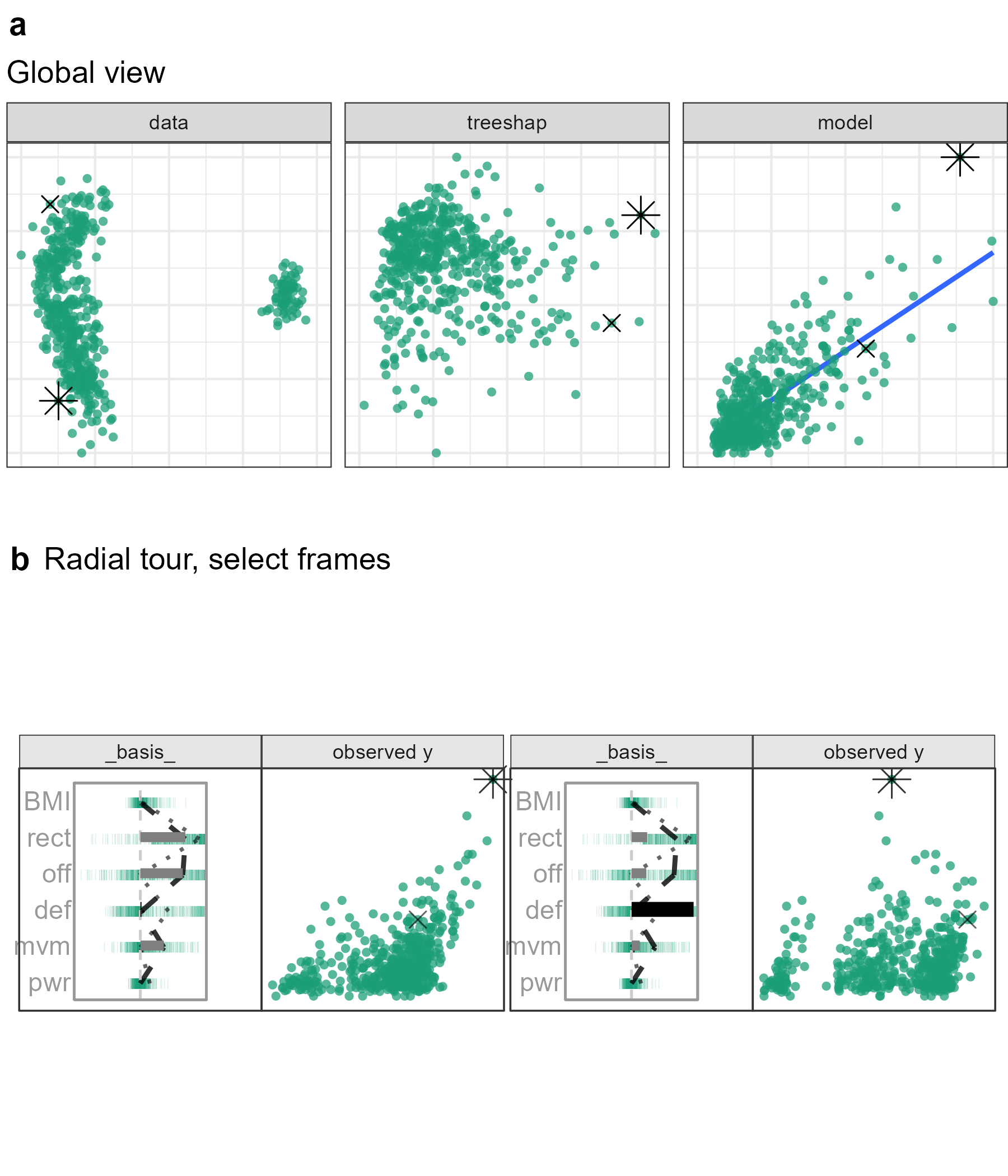
Figure 5.8: Exploring the wages (euros) relative to skill measurements in the FIFA 2020 data. Star offensive player (L. Messi) is the PO, and he is compared with a top defensive player (V. van Dijk). The attribution projection is shown on the left, and it can be seen that this combination of variables produces a view where Messi has very high predicted (and observed) wages. Defense (def) is the chosen variable to vary. It starts off very low, and as its contribution is increased (right plot), it can be seen that Messi’s predicted wages decrease dramatically. The increased contribution in defense comes at the expense of offensive and reaction skills. The interpretation is that, indeed, Messi’s high wages are most attributable to his offensive and reaction skills, as initially provided by the local explanation. (A video of the animated radial tour can be found at vimeo.com/666431163).
Figure 5.8, tests the support of the local explanation. Offensive and reaction skills (off and rct) are both crucial to explaining a star offensive player. If either of them were rotated out, the other would be rotated into the frame, maintaining a far-right position. However, Increasing the contribution of a variable with low importance would rotate both variables out of the frame.
The contribution from def will be varied to contrast with offensive skills. As the contribution of defensive skills increases, Messi’s is no longer separated from the group. Players with high values in defensive skills are now the rightmost points. In terms of what-if analysis, the difference between the data mean and his predicted wages would be halved if Messi’s tree SHAP attributions were at these levels.
5.3.4 Ames housing 2018, sales price regression
Ames 2018, housing data was subset to North Ames (the neighborhood with the most house sales). The remaining are 338 house sales. A random forest model has fitted this price [USD] with the property variables: Lot Area (LtA), Overall Quality (Qlt), Year the house was Built (YrB), Living Area (LvA), number of Bathrooms (Bth), number of Bedrooms (Bdr), the total number of Rooms (Rms), Year the Garage was Built (GYB), and Garage Area (GrA). Using interaction from the global view, a house with an extreme negative residual and an accurate instance with a similar prediction are selected.
![Exploring an observation with a large residual as the PO from fitting sales price [USD] to other variables in the Ames housing 2018. The sale price of the PO was under-predicted. The local explanation indicates a sizable attribution to Lot Area (LtA). The CO has a similar predicted sales price and smaller residual and has minimal attribution to Lot Area. In the attribution projection, the PO has a higher sales price than the CO. Reducing the contribution of Lot Area brings these two prices in line. This suggests if the model did not consider Lot Area, then the two houses would be quite similar. That is, the large residual is due to a lack of factoring in the Lot Area for the prediction of PO’s sales price. (A video showing the animation is at vimeo.com/666431134.)](figures/ch5_fig9_case_ames2018.png)
Figure 5.9: Exploring an observation with a large residual as the PO from fitting sales price [USD] to other variables in the Ames housing 2018. The sale price of the PO was under-predicted. The local explanation indicates a sizable attribution to Lot Area (LtA). The CO has a similar predicted sales price and smaller residual and has minimal attribution to Lot Area. In the attribution projection, the PO has a higher sales price than the CO. Reducing the contribution of Lot Area brings these two prices in line. This suggests if the model did not consider Lot Area, then the two houses would be quite similar. That is, the large residual is due to a lack of factoring in the Lot Area for the prediction of PO’s sales price. (A video showing the animation is at vimeo.com/666431134.)
Figure 5.9 selects the house sale 74, a sizable under prediction with an enormous Lot Area contribution. The CO has a similar predicted price though the prediction was accurate and gives almost no attribution to lot size. The attribution projection places observations with high Living Areas to the right. The contribution of the Living Area contrasts the contribution of this variable. As the contribution of Lot Area decreases, the predictive power decreases for the PO, while the CO remains stationary. This large amount of importance attributed to the Living Area is relatively uncommon (as evidenced by the parallel coordinate overlay on the basis). Boosting tree models may be more resilient to such an under-prediction as they would up-weighting this residual and force its inclusion in the final model.
5.4 Discussion
There is a clear need to extend the interpretability of black-box models. This chapter provides a technique that builds on local interpretations to explore the variable importance local to an observation. The local interpretations form an attribution projection from which variable contributions are varied using a radial tour. Several diagnostic plots are provided to assist with understanding the sensitivity of the prediction to particular variables. A global view shows the data space, explanation space, and residual plot. The user can interactively select observations to compare, contrast, and study further. Then the radial tour is used to explore the variable sensitivity identified by the attribution projection.
This approach has been illustrated using four data examples of random forest models with the tree SHAP local explanation. In the penguins example, we showed how the misclassification of a penguin arose due to it having an unusually small flipper size compared to others of its species. This was verified by making a follow-up plot of the data. The chocolates example shows how a dark chocolate was misclassified primarily due to its attribution to Fiber, and a milk chocolate was misclassified as dark due to its lowish Sodium value. In the FIFA example, we show how low Messi’s salary would be if it depended on defensive skills. In the Ames housing data, an inaccurate prediction for a house was likely due to the Lot Area not being effectively used by the random forest model.
This analysis is manually intensive and thus only feasible for investigating a few observations. The approach selects observations that the model has not done well in predicting and compares them with an observation where it did predict well. The radial tour launches from the attribution projection to explore the prediction’s sensitivity to any variable. It can be helpful to make additional plots of the variables and responses to cross-check interpretations made from the cheem viewer. This methodology provides an additional tool in the box for studying model fitting.
An implementation is provided in the open-source R package cheem, available on CRAN. Example data sets are provided, and you can upload your data after model fitting and computing the local explanations. In theory, this approach would work with any black-box model, but the implementation currently only calculates tree SHAP for tree-based models supported by treeshap (Liaw and Wiener 2002; Wright and Ziegler 2017; tree based models from gbm, lightgbm, randomForest, ranger, or xgboost Greenwell et al. 2020; Chen et al. 2021, respectively; Shi et al. 2022). Tree SHAP was selected because of its computational efficiency. The SHAP and oscillation explanations could be added with the use of the DALEX::explain() and would be an excellent direction to extend the work (Biecek 2018; Biecek and Burzykowski 2021).